This is part one in a two part series about how we revamped the charts in our video analytics product. If acronyms like D3, obscure javascript references, and absurdly-named dev tools are your thing, you'll have to wait for part two (subscribe). Otherwise, read on for a look at our design process behind the new charts.
We work with some large datasets at Mux (I refuse to describe data as big). Data visualization and aggregation happen to be great tools to tell a story about a lot of data, yet they can be contentious topics around the web. I think what makes data visualization so interesting is that it's this rare intersection of two different worlds: the world of objective, "cold hard math" and the world of aesthetics and visual communication.
When we wanted to revisit our charts, we looked at them from both of these perspectives and asked ourselves: Are we being truthful to our calculations? And, are we presenting the data in a beautiful and sensible manner?
Problems with our old charts
After looking through these two lenses, we had all sorts of grandiose ideas about how we could improve our charts. But before jumping headfirst into a new charting library to play around, we knew it was important to define the problems we wanted to solve that our existing charts couldn’t. We ended up defining five specific problems:
- Aggregation + line charts can be misleading.
- Data spikes needed context.
- Breaks in low-volume data resulted in ugly, unhelpful visualizations.
- Comparing dimensions got unwieldy, especially for the color blind.
- Gridlines, axis labels, and tooltips were causing visual clutter.
1. Aggregation + line charts can be misleading.
Line charts are great at showing data trends over time, but they imply a continuous, sequential data series. Each data point in our platform is actually an hour of aggregated video view data. Was this clear to our users? How might we better communicate where the aggregation is happening? Were we just connecting dots to make pretty lines and not being truthful to the data?
2. Data spikes needed context.
Product designers often talk about how good data visualization shouldn’t just answer questions about data but also surface new questions. Completely agree. But, if you’re getting the same question every time, why not help answer that question early on in the user’s data discovery process? We realized almost every time a customer had a spike in their data we’d get the same question...
“What was my volume during that time?”
Even after they asked this question, we had no good way in our UI to provide them with an answer.
3. Breaks in low-volume data resulted in ugly, unhelpful visualizations.
Not all of our customers have large, steady volumes of video views and we needed to make sure our charts provided value no matter the volume. Our mission is to help everyone build better video. That solo developer doing video for the first time is going to need our metrics more than anyone, but they’re not likely to have much volume right away.
With our old charts, users might not even see the tiny pink specks of data because the specks aren’t connected to another data point. In other words, our users couldn’t even tell where they had data in the first place if their volume was low.
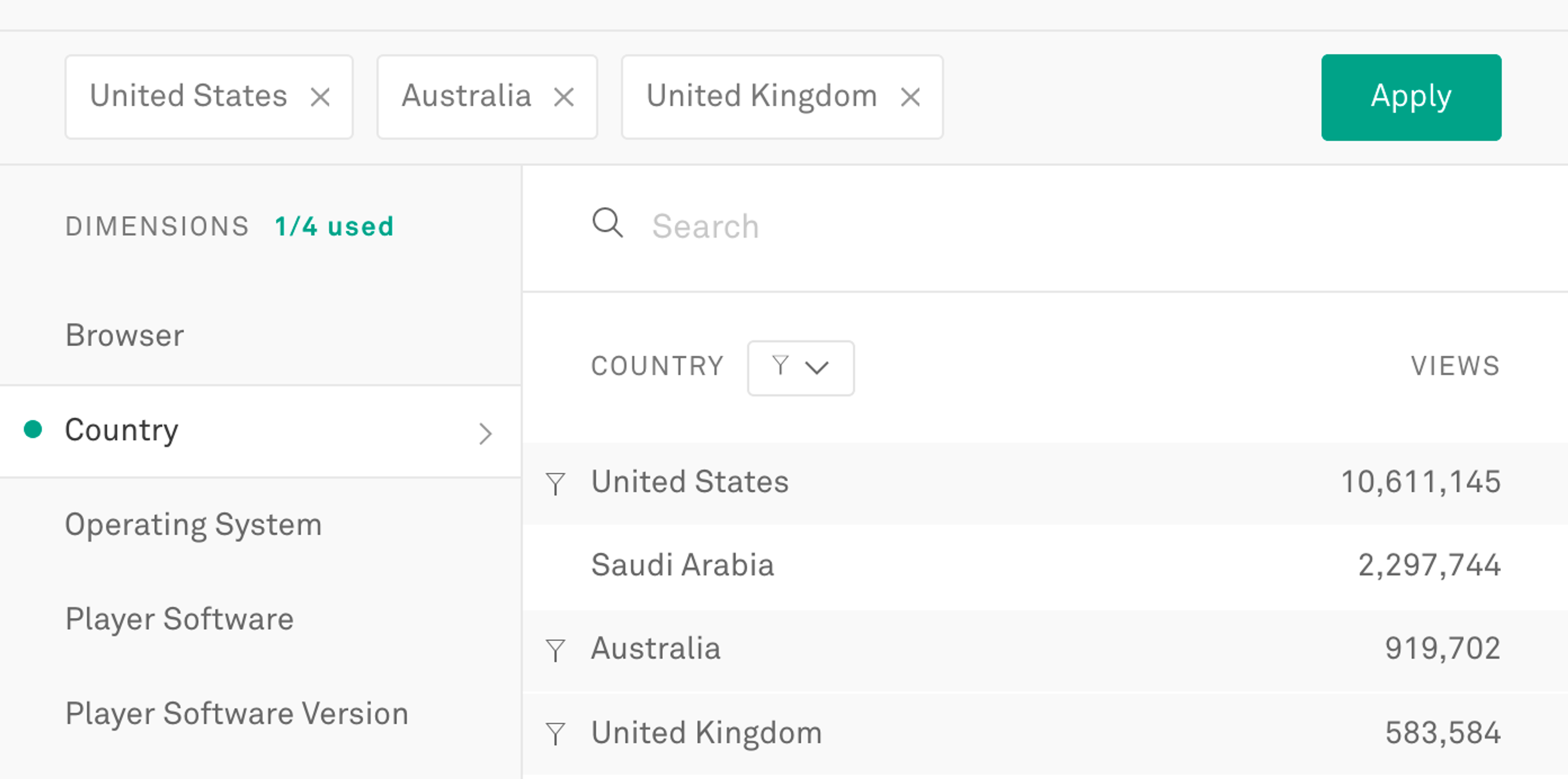
4. Comparing dimensions got unwieldy, especially for the color blind.
Quickly comparing different dimension values helps our users get context to issues as well as assess their relative severity. While our tabular UI was great at this, our multi-line chart was messy and difficult to interpret. Trying to hover for details of a specific time period was even more problematic.
On top of all that, I ran a color blindness tool and realized we had some accessibility issues with Deuteranopia, the most common form of color blindness.
5. Gridlines, axis labels, and tooltips were causing visual clutter.
Sadly, these elements are often overlooked details in chart design. Does anyone actually use gridlines and axis labels or do they simply read the tooltip? Can we get away with just horizontal gridlines? Or would vertical lines be better? What about both? Should they be dotted or have transparency?
Designers and developers are often lazy with gridlines and axis labels because customizing them requires a lot of small decisions about something that’s not directly representing data. Even though these decisions don’t affect the data itself, how you frame lines around your data will affect how the user perceives it. For example, using very few vertical-only gridlines and few axis labels gives the data a lot of beautiful whitespace, but it feels more like an estimate rather than a precise representation.
The old tooltips didn’t snap to data points and were clearly not written for humans to read.
Designing a solution
Once we had these problems mapped out we added the high level questions we wanted to answer for our users:
- Where are my viewers experiencing problems?
- How has METRIC been trending?
- Where have we had spikes or issues over TIMEFRAME ? And for METRIC ?
- Are we spiking during certain times of day?
- Is there a relationship between METRIC and my volume?
I also set three guidelines for myself as I mocked up different solutions:
- The charts should always be answering a user question (above) as quickly as possible.
- Use as much real data as possible. (InVision’s Craft plugin for Sketch is super helpful)
- Any given chart type should scale to different amounts of data points, including broken/ low-volume data.
I tried A LOT of chart variations, always testing scale of timeframes and granularity.
What about the classic bar chart? 📊
Looking at problem #1 (accuracy in aggregation) and #3 (breaks in low volume) I asked myself if bar charts would be more appropriate because each bar represents a 1 hour window of aggregation. There’s no false connection implying data that isn’t there. Yes… YES. I was getting somewhere and excited about the bars as I mocked up different amounts of data points. I even started playing around with different styling.
And then I had to think about comparing multiple dimension values (e.g. browser types)… and the wind left my sails, or maybe I just let out an audible sigh. How would we use bars for multiple dimension values? Side-by-side bars were not going to work with four or more dimension values. Stacked bar charts would not make for good comparisons of each individual trend either (and let’s be honest, stacked bar charts are almost never a good idea).
I even tried dumb things like the image above. Then we thought about going back to a line chart for comparisons, but we didn’t want to switch visualization types when a user went from the main metric chart to comparing dimensions; it would be too disruptive to an important user flow.
Let's make a decision
After flip-flopping seventeen more times (according to my engineering counterparts), I came back to a modified version of the original line chart with three seemingly small yet significant changes:
- Filling in the area below the line (not necessarily a true area chart... we weren’t doing any of that stacking/overlapping nonsense).
- Adding big ol’ dots for every data point (where aggregation was happening).
- Adding a new secondary bar chart below to show volume impact over time.
Friendlier visualizations for our low-volume friends.
By filling the area below the line we added a tangible aspect to the data, making gaps in data obvious. The vertical wall of the fill made it easier to tell where the data stopped and started. The large dots for every data point helped this even further.
Better comparisons for all.
Another perk of the large data points was that they made for better comparisons by allowing users to see where different values line up vertically. You’ll notice we dropped the area below the lines when comparing two or more values to help users see what is above and below. We also capped the comparison limit to four values based on usage stats and sheer intelligibility.
Oh, and the new charts are now color blind accessible for Deuteranopia, Protanopia, and Tritanopia. 😀
Making interactions, tooltips, grids, and guides feel precise.
At Mux we pride ourselves on the accuracy of our data, it’s a differentiator for us. We wanted our charts to represent this accuracy and even feel precise. To do this we chose to use both horizontal and vertical gridlines. We added a vertical guide to show exactly what timeframe a user is hovering within. We cut out any delay in the tooltip. And we chose dashed lines for the grid to further help the user delineate between a line that is representing data and a line that is just there as a visual reference.
Fancy new tooltips 💅
Improved responsiveness of charts. More to come.
Charting ahead
(Sorry, I couldn't help myself)
By the time this blog post goes out, we’ll probably have at least 3 more changes made to our charts. In fact, I feared this post might never go out. Every time I sat down to write about our thought process or grab a screenshot of real data, I found more areas we needed to reexamine. Then I ended up waiting around for those new changes to be implemented to finish writing. It’s a vicious cycle. But the beauty of being a bumbling solo product designer in a sea of super efficient engineers is that they push you to get stuff out before you’re comfortable with it. Well “push” is being generous; they just launch the stuff.
Anyways, the feedback from our customers has been great so far and we always want more. I'd love to hear from you on Twitter @MuxHQ, even if it's just to pick a fight about things I despise like spline interpolation, stacked bar charts, or bashing the innocent pie chart. Yes, contrary to all the trendy tweets, I believe pie charts still have a small place in this world.
Stay tuned for part two where Matt McClure talks about how we actually built these charts.
Shameless plug: If you’d like to see your video performance data visualized with our new charts, head on over to our self-serve sign-up page and integrate in minutes.