
It's wild times for a lotta tech companies and start-ups right now. Many are pushing for efficiency, cutting back, and tightening things up for the long haul, so it seems like the last thing on anyone’s minds should be, “how do we feel about our pink? Is it too pink or…gasp…not pink enough?”
But there we were, asking those exact questions (along with bigger theoretical ones), as we built our new brand over the past several months.
Yep. We spent this recession-shaped-thing doing the biggest brand refresh in our 7-year life as a company. And you know what? We’re pretty excited about it, and we don’t regret a damn thing. Because investing in your brand is pretty much always the right thing to do, even when it feels like a big, expensive, and potentially risky undertaking.
Sure, we were nervous, and even a little scared to rebrand during such a tumultuous time. But we’d seen investing in our brand work for us before, so we took a deep breath and set off on our journey.
What follows is our deep dive into everything brand: Why it’s important, what a rebrand consists of, and where to start, should you find yourself in need of one.
Why brand matters
I would tell people the size of Mux…30 people…and they'd be like, oh, whoa, I thought you guys were like, 200 people. And then when we were a hundred people and they were like, I thought you were a thousand people.The investment in brand just made Mux feel bigger, more mature. And that is crucial when you're trying to communicate to somebody that you are a reliable infrastructure (for them to build their business on).
Brands make people feel things. Whether you like it or not, one way or another, your brand is going to evoke a feeling.
When times get tough, many companies will pull back and invest less in the details (the brand), which can have an unintended cheapening effect. Some areas of the business that seem like nice-to-haves are actually the first touchpoints that potential customers might interact with. So if a first impression evokes a feeling of boredom, sticker shock, or skepticism, that’s a wasted opportunity, and it’s hard to get people back once they’ve gone there.
BMW and other luxury car companies famously have teams of people working on the sound a door makes when it closes. Now, obviously, a car’s purpose is to drive safely from one place to another, but BMW knows that folks trust their brand for the extra little details that will make them feel like they bought something high quality. The feeling about the sound the door makes extends all the way to how they feel about the engine. “Must be well engineered!”
For a few easy wins, or to get your product out the door, you can build something quick and dirty, sure. But if you want to build a loyal customer base, full of people who will wear your T-shirt and recommend you to their friends, you’ll need to invest in the details up front. Especially if you’re an infrastructure product, sweating the details builds trust that you, well, sweat the details. You’ve gotta suck it up and, even when it feels silly, make your car doors sound expensive.
Why brand matters: change is inevitable
While we joke about shades of pink, the fact is that after 7 years of working hard, building Mux, raising capital so we could build more Mux, and so on, we had changed. We had grown from a devtool company offering a Quality of Experience Data product to a full-fledged video infrastructure company. But even with that growth, our potential customers were seeing us for who we were, rather than who we are now.
In addition to our product offering changing, our whole market changed around us, too. When we initially branded in 2016, we felt like we were on the cutting edge of an aesthetic; now, we just looked like everyone else. Looking down at our jean shorts, we admitted it was time for some sort of a visual change.
We turned the mirror on the brand. We dug around the website, wore out our screenshot shortcuts, and pulled every living piece of the Mux brand into one place so that we could fully reflect as a team and ask ourselves the hard question. “Is it actually time for a rebrand??”
It is. But what does that even mean? I’m so glad you asked.
The ingredients of a rebrand
This is hugely reductive, but in my experience, a rebrand consists of some specific ingredients: the audit, the strategy, the narrative/idea, the visual aesthetic, the voice and tone, and every little detail in between.
Like any recipe, these ingredients can be introduced in a variety of ways, and the right composition will vary from company to company. This was our approach.
The audit
The time the vendor printed the wrong shade of green. The Papyrus phase you went through after that Ryan Gosling SNL sketch. The quick one-off landing pages and the last-minute illustrations you meant to replace that one time that, oops, live on the website forever now. You have to get all that stuff into one place and talk about your feelings. It’s an ephemeral process, and you might be surprised to see that, usually, everyone’s on the same page about what “feels right” or “feels off.”
After going through this process ourselves, Jon Dahl, our CEO and Co-founder, said it best:
It all just feels stale.
If this is the CEO’s sentiment, imagine what your customers are thinking about your appearance. Be honest: Are you presenting your best self? Does your brand reflect who your company is, what you stand for, and where you’re going? All great food for thought.
The narrative
Now. Imagine George Clooney speaking over inspiring footage of families walking in slow motion through a field of flowers, saying inspiring things like, “in times like these, the things that matter are the things that connect you to the people you love the most. …Cheetos.”
And you’re thinking, “what? Was that an ad for Cheetos?” THAT is a brand narrative.
Anyway, people can get carried away with these. But they ARE important, I promise.
When developing a narrative, you need to make sure you’re honest with yourself. Radical candor is key during this phase, because if anything feels off, or contrived, or weird, it will show up in your work later. On the flip side, this process can help you unlock your purpose as a company and help to clarify REAL focus and authority that will trickle down to every employee.
In building our narrative, we arrived at something thoughtful, philosophical, aspirational, and genuine, with a focus on a lighter yet empowered perspective on infrastructure through the lens of playfulness.
It was perfect! But it’s also 11 paragraphs long. So the next step is to take those 11 paragraphs and turn them into something digestible. Something you could put on a T-shirt, or a sticker…
The brand idea
A brand idea gives your whole company something they can stand behind in a few words. In its sticker form, it can sit next to you while you work and gently remind you to stay focused on the task at hand, on your brand’s purpose, not on the other guy’s. In its T-shirt form, it can remind others that you are smart, and that you wear cool T-shirts.
With our brand idea, Built to Play is both literal and motivational. Mux was built to help developers do what they do best (creatively build things!). And play has a double meaning: to have fun, or to watch a video. This play on words (get it?) made us feel really cool and smart.
‘Built to Play’ felt really great because great developers are artists. When you provide great tooling for them to build with, you're just giving them an even bigger canvas, you're unlocking even more things that they can use to build more interesting things on top of.We are building the infrastructure here that's reliable and great at what it does so that you can build your product.
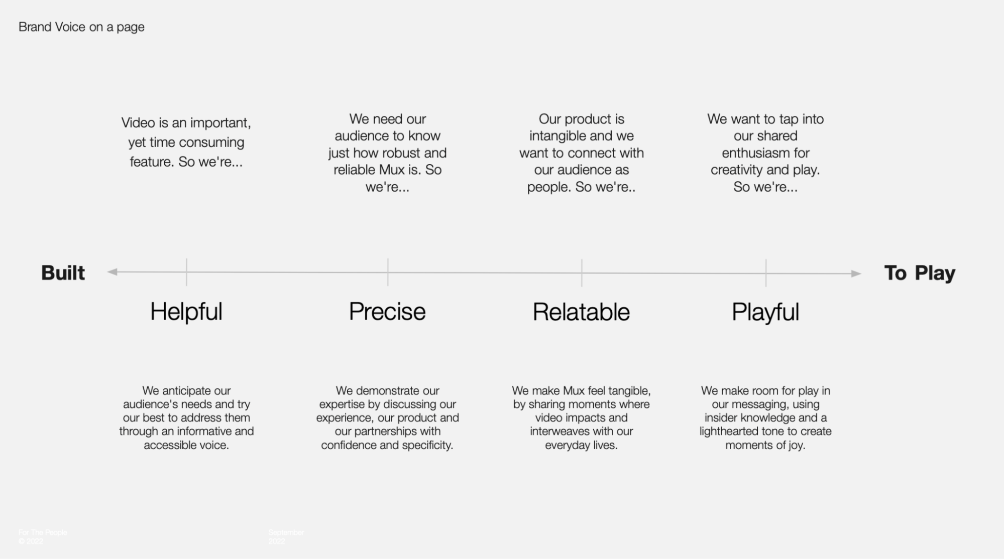
Voice and tone
When most people think of a brand, they think of a logo and some colors, maybe some blobby drawings, or even a mascot. But the most influential yet seemingly invisible piece of a brand is the way a company sounds in written and verbal communication.
Voice
When your brand is speaking, the voice should never change. The style of the voice needs to be identified. Who are they, if they’re a person? How would they speak when they’re neutral? Are they super buttoned up all the time, or are they kinda chill?
The way my mom would talk to me when she was teaching me how to drive a stick shift was very different from the way she’d speak to me when I got all As on my report card. She was always herself — warm, direct, even tempered. But depending on the circumstances, her tone would shift from aware and helpful to excited and cheerful (and, let’s be honest, tearful — love a happy cry!). Your company is no different.
We already had a pretty firm grasp on Mux’s voice, and we didn’t feel the need to do anything drastic to address it during the post-pandemic what-have-yous of 2021. But we now had a team of people writing in that voice, so we needed to solidify some of the unspoken rules to get everyone on the same page and move forward with more cohesion.
Tone
How should you sound when you’re trying to warn a user that they’re about to delete several years' worth of data? Or how about when a customer has successfully hit a milestone and you’re super excited for them?
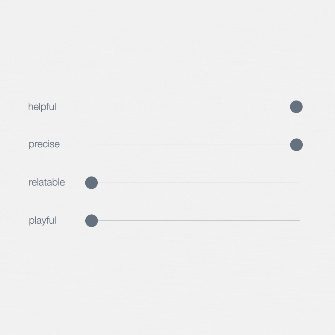
This is where our brand idea, Built to Play, could start doing the heavy lifting for us. We now had a literal sliding scale that we could use to help inform our writing, in everything from blog posts (Like this one! Playtime!) to our pricing page (Build mode. Helpfulness is king.)
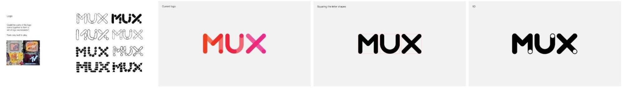
Do you blow up the logo?
We designed our logo 7 years ago, based on something the founders said when I asked them why they were building Mux.
In starting this company, they were moved by the philosophy of “a whole being greater than the sum of its parts.” They saw an opportunity to build a company that would give developers simple tools that would inspire huge, powerful innovation, in a fun and playful way. So we built a logo based on the pieces of an Erector Set. Something fun, functional, and tactical that can come together to create anything. A few metal bits and bobs are suddenly a DINOSAUR. Or a ferris wheel! We traced Erector Set pieces and put them together to create the word “Mux.”
This pink logo has a lot of history now, and while I personally was toooootally fine to change it, and the founders were kinda open to the idea, we identified a mismatch with our old logo and our new brand purpose. It didn’t feel big enough, powerful enough, ready to inspire massive potential for innovation.
Would people still know it was us if it changed too drastically? Despite the recession-shaped offshoot of the multiverse we’re in, we aren’t going anywhere, and it’s important that our brand reflects that.
But if we don’t do anything with the old logo, we risk feeling stale and out of touch with who we've become. We needed to freshen things up. SO. A new logo? Yes. But one that’s representative of who we are and who we have always been.
We asked our partners to set out and develop something that felt old, and new. Easy, right?
They gave us many tremendous options. Ultimately, we decided to go with a new version that was lighter, more modern to the digital age, did front flips and backflips, could switch itself on and off, and ultimately represented that moment of Play while also being kind enough to sit still and act as the Built component of Mux.
When it comes to your logo, here’s my best advice: Listen to your gut.
That might sound generic, but before you even look at new trends or new options, and before you even think about putting an arrow in the negative space of your logo, ask yourself if it even needs to change at all. If it does, by how much? No matter what, if you believe in it and stick to it, nobody will give a hoot in 5 years (or 5 months), and that’s the beauty of logo design. It can be polarizing at first, but as the novelty wears off, people just kinda accept it for what it is.
While considering your logo, you should, in tandem, be considering your whole vibe as well. I always say that a logo (or a home page) is like the cover of a book. It’s hard to design the cover if you don’t know what the book is about, so go ahead and “write your book” (build your brand identity), and occasionally check in on the logo and how it’s progressing. Once the book is finished, the logo will feel obvious. Don’t fret. Don’t rush it. Speaking of your whole vibe…
The whole vibe
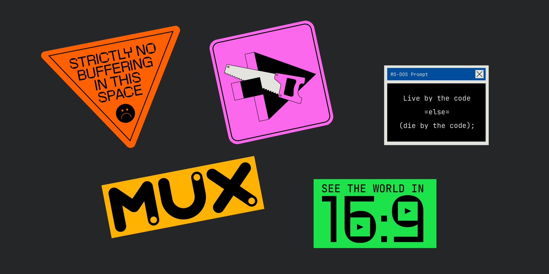
There's a generic template out there for API tools like ours. Enter the font and big, bold letters at the top. Lots of white space, lots of gradients.And the fact that we decided not to go that way stands out and sticks with you through every pixel of the website.
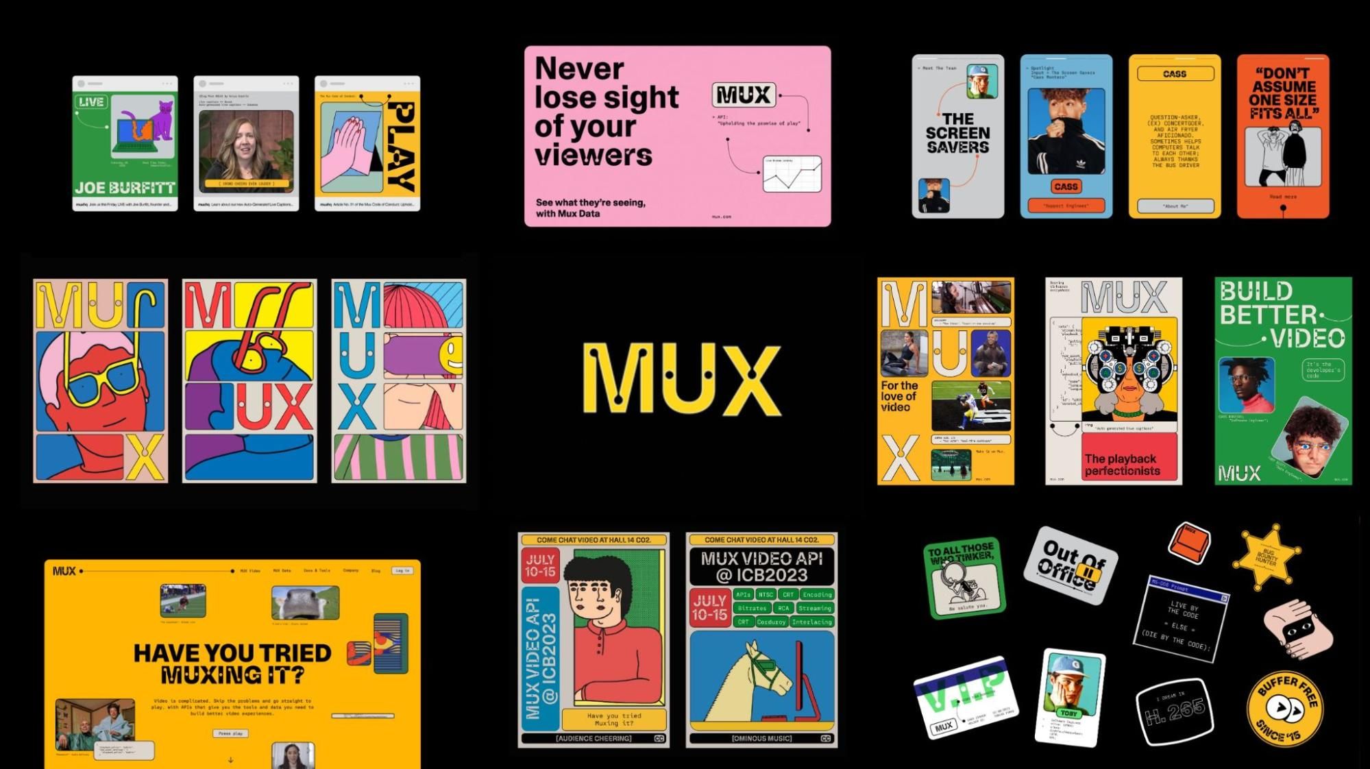
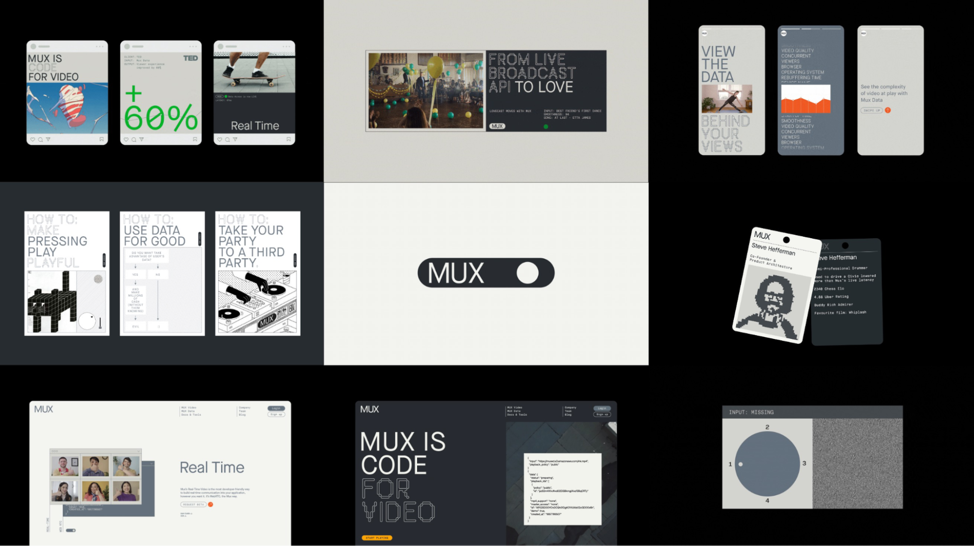
It was time for Built to Play to inform the entirety of our visual style. The vibe. The stuff that people see that jumps off the page and grabs their attention.
Our friends at For the People translated Built to Play in two distinct styles for us to talk through.
Option A
Our first option leaned super heavy into the play side. A little too heavy. In the first direction, the Mux brand felt a little too much like a person who likes to have a good time and maybe wiggle while they walk to (ironically) grab an acai bowl or an (unironic) lavender blue algae ube latte on the corner in their Very Cool neighborhood.
A lot of what was there was, indeed, Very Cool, but we felt like we needed to pull it back a little bit and stay true to who we are: A bunch of nerds who are super obsessed with API tools.
Option B
The second direction spoke more to that nerd we truly are deep down. But this direction made Mux feel a little too much like a person with several perfectly functioning vintage Macintosh Plus computers on the shelf in their Zoom background.
So we did the thing that every branding agency hates to hear. (I used to work for one, so I know!) I cringed as I asked…
Could we just marry these two directions?
We felt like we had Built and Play here, on two opposite ends of the spectrum, and now we needed to find our middle ground. And at this stage in the project, around July 2022, we could feel the temperature shifting in the industry, as well as a change in our buyer persona. We knew we were going to need something that could resonate not only with the curious builder, but with their manager, and their manager’s manager as well.
Pro tip: Don’t just design for your end user. Design for your user’s boss, and their boss’s boss as well.
Option A+B
Asking For the People to develop a third direction for us resulted in one of those “yes” moments.
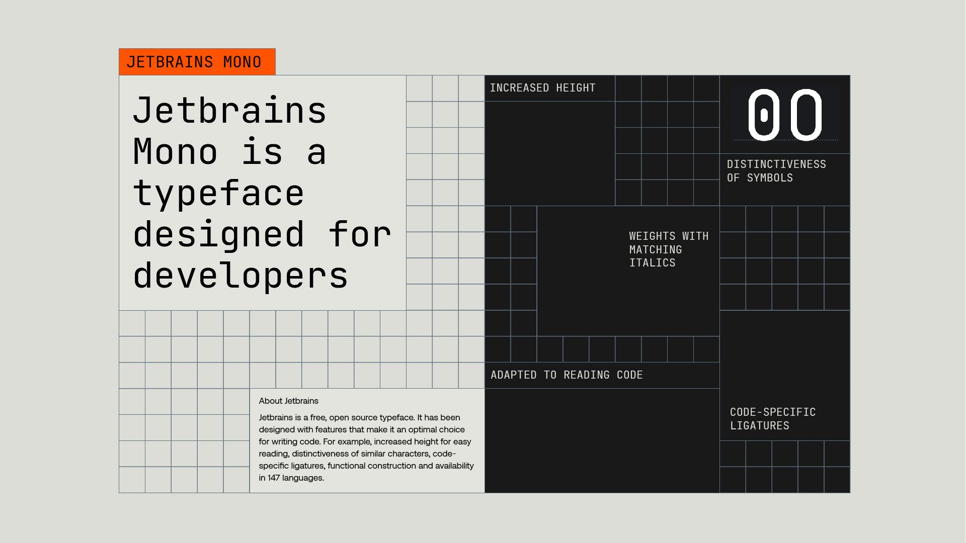
They developed a direction for us based on MACROBLOCKS & THE GRID. How delightfully nerdy, and fun! And smart looking, powerful, and dynamic. (Actually dynamic — with dynamic type and everything!)
There was a powerful presence in this grid that keeps things structured while colors, fonts, and illustrations make it playful. Once this macroblock/griddy direction was chosen, everything else locked into place quickly and neatly.
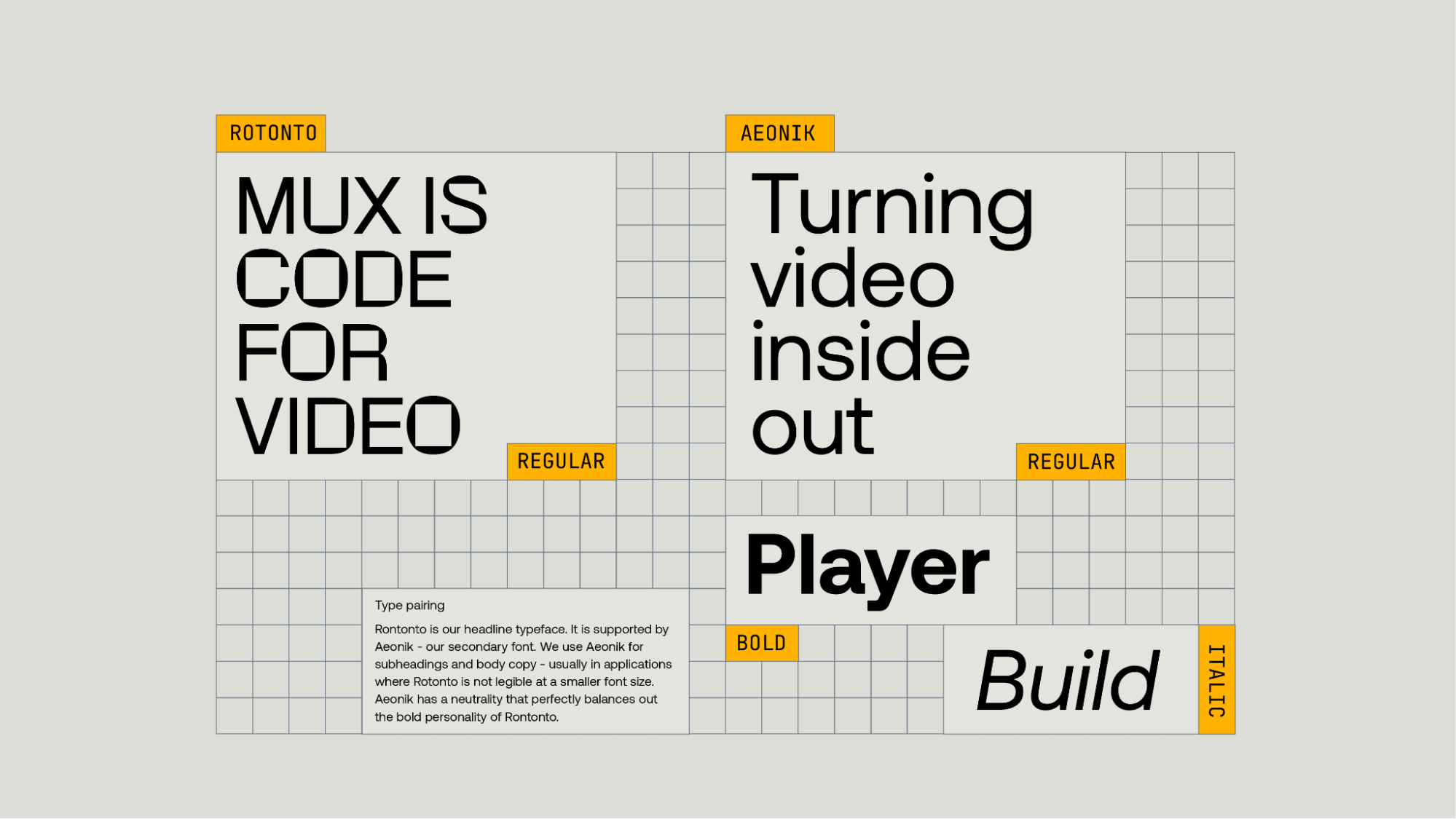
Meet Rotonto, your quirky cousin who gets a little too buzzed at weddings but you love them anyway.
Rotonto is a variable typeface that underlies the contrast between rigid, square-shaped counters of the letters and the round-shaped outline. The proportion and the general construction follow the peculiarities of a grotesque typeface that it gives the opportunity to be used in different contexts.
And Aeonik, a reliable modern classic, provides the structure you need to feel safe and supported, while winking to you that it cares about form just as much as functionality. The perfect complement to its wacky cousin Rotonto.
We knew that our monospace font was going to be super important, because our founders are developers, and between you and me, they’ve had a lot of…opinions…about what makes a mono font legible in situ.

With enough time, we found a typeface that we were all happy with. Jetbrains is an open-source font, which resonates with our ethos as a company.
The point is, you don't have to say yes right away. This is an iterative process. You'll know it when you see it, hear it, smell it, dream it, bleed it.
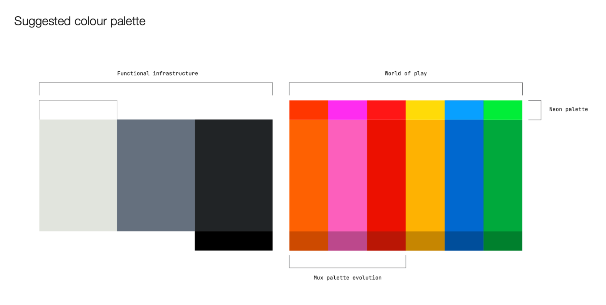
The color palette
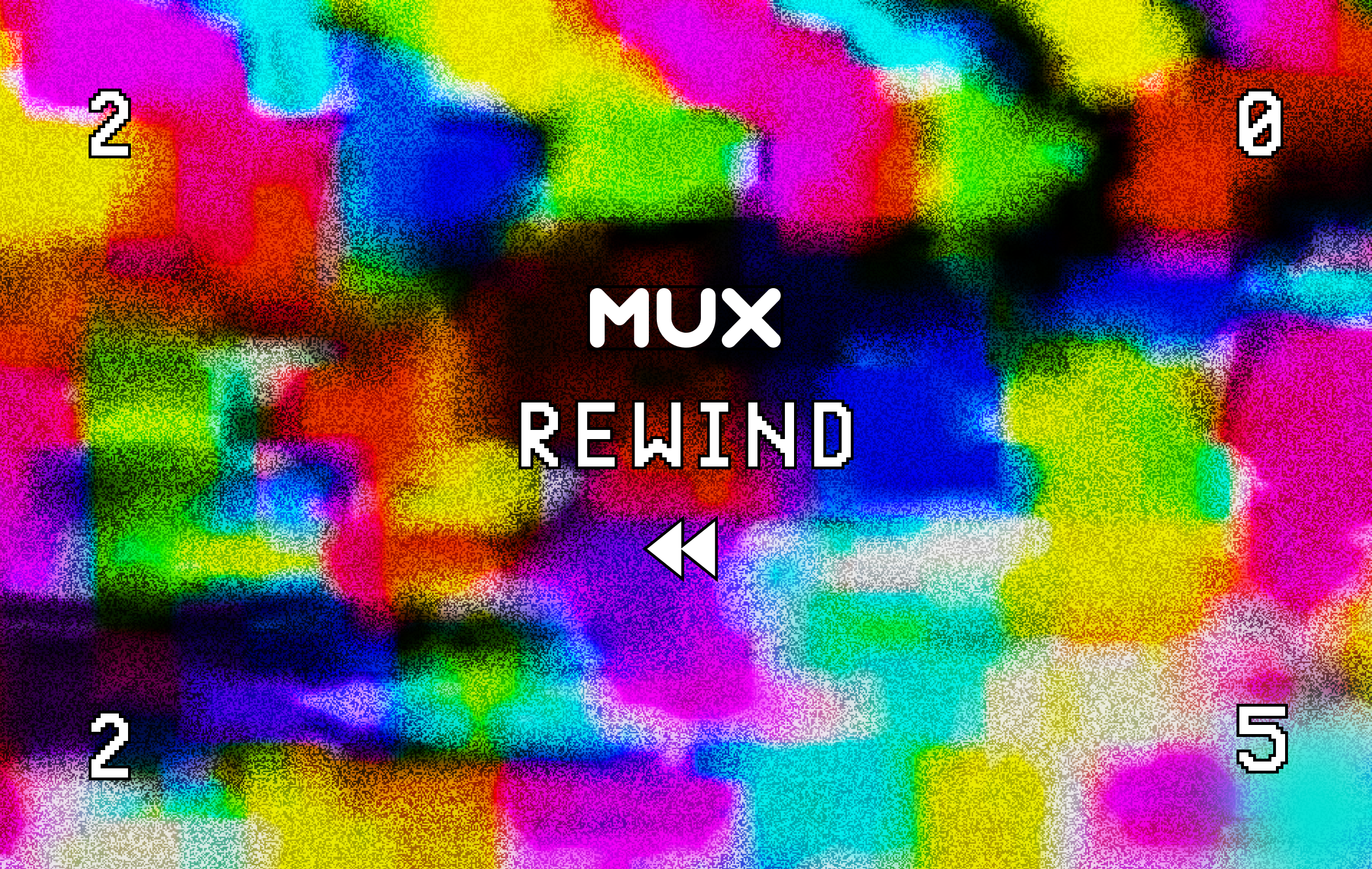
I developed our original palette in 2016. It started as an “I dare you” moment with the founders. Their initial take on their brand was black, stark, and looked a little bit like something Neo would have used to brand his GeoCities site with.
Not that there’s anything wrong with that, but I wanted to challenge them to stand out in their quadrant of the developer-centric market. I bet that if you use pink, and make your brand look as fun and friendly as I know you all are deep down, people will still like you, and they’ll still get it.
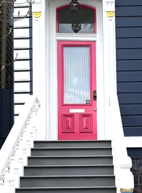
The pink thing worked, and years later, one of the founders liked it so much that he painted his front door with the exact Pantone swatch.
There were pink stools at the office, pink walls, pink everything! I was so happy that they embraced this core brand decision, and I also knew that changing this core brand color might be just as painful as changing the logo.
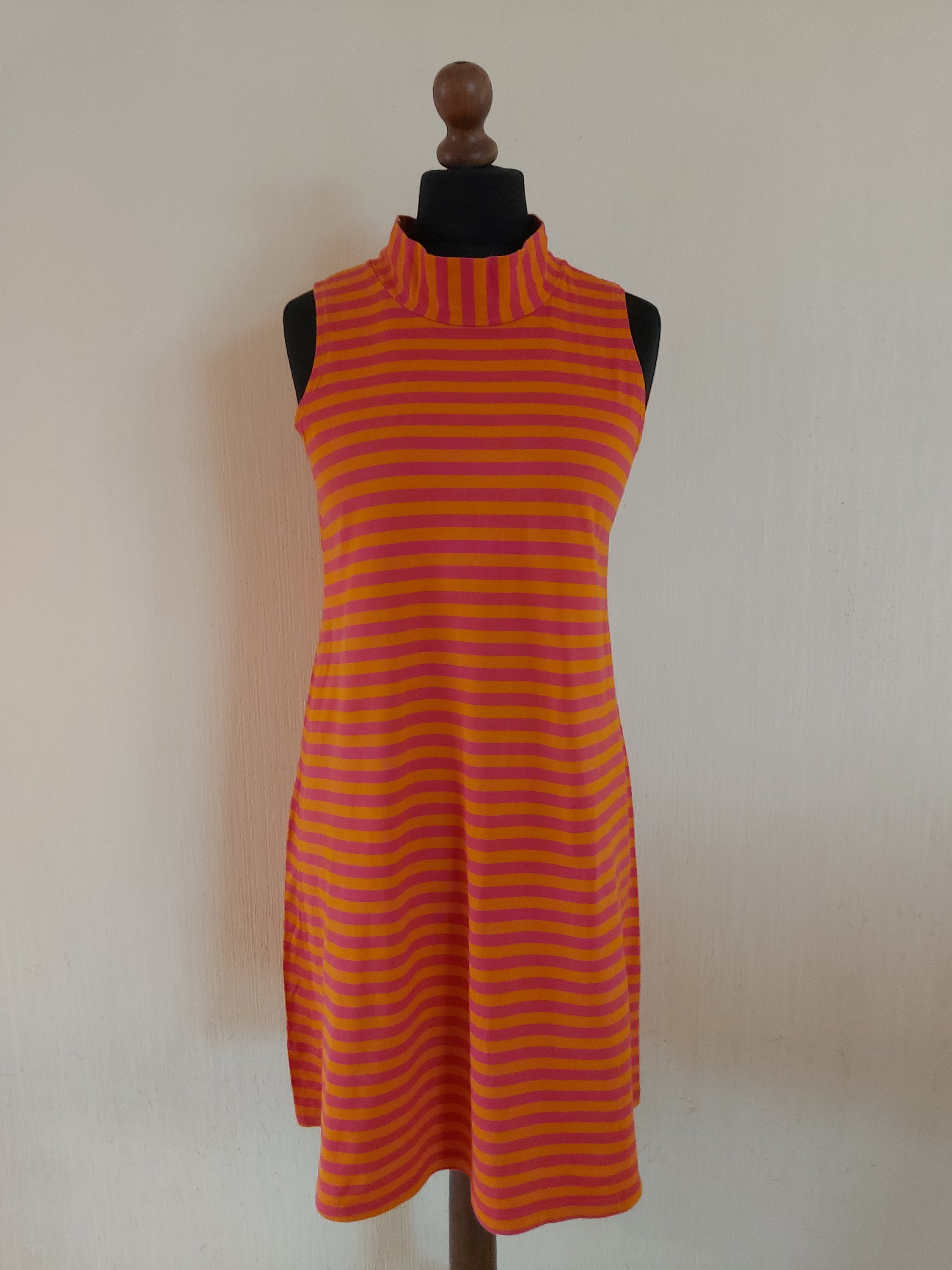
But we needed a new palette to go with our new brand, and FTP delivered once again. These colors give us plenty of flexibility to work toward our Build side and our Play side equally. Personally, I love this palette so much and have unintentionally based my whole wardrobe off of it over the past few months, down to this vintage Marimekko sauna dress from the 1960s. Oops!
Doing this work is easy(ish) once you have your narrative and your idea and purpose in place. Have fun with it, and let that initial brand idea inform everything. If you find yourself scratching your head about whether you like a font because it’s right or just because it’s interesting, look back on that narrative and let it guide you. HAVE FUN, and you will know when it’s right or when it’s contrived.
Where do you even start?
After admitting to yourself that it’s time for a change, it can be tempting to scour the internet to see how somebody else did it, and just copy them. Well-established brands can have a smoke and mirrors effect, like a siren pulling your ship onto the shore, but we’ve learned that at this early stage, it’s important to resist the urge to mood-board and to instead take the more vulnerable journey inward. To develop a deeper understanding of who we are — into our meaning and purpose. (Chills, right!?)
Take a look inward
Building a sturdy brand that speaks to a discerning audience in a way that’s clear, concise, and inspiring for years to come, from a place of understanding that’s confident and genuine and deep and not contrived and completely unique to you is…hard. Sometimes that kinda work requires an outside perspective. In our case, it meant finding a therapist brand agency to help.
We searched far and wide and knew we found the right partners in For The People, an Australia-based brand and strategy agency whose purpose is to build lasting brands for “people who are weirdly and wildly passionate about their thing, whatever that thing is.”
Ask for help
It’s okay to ask for help! Lots of teams feel the pressure to do everything internally, and while that’s fun, too, sometimes an outside perspective can be super helpful, especially with things like purpose and strategy. Because it seriously is just like therapy at that part of the process. We liked FTP because the folks on their team were grounded, helpful, and deeply curious. If you do end up going this route, don’t stop searching until you’ve found a partner who shares your values, too.
Your brand is dead. Long live your brand!
Brands are like sharks. If they stop moving, they die. It’s a race against time to live your brand out loud while it’s still relevant, so that you can move to the phase of shepherding and evolving. Use metrics dashboards to track your success, and iterate just as quickly as you hit the launch button.
Don’t let your brand die. Keep having the conversations, especially the hard ones; raise little flags when things feel off; and continue to ask yourself, “Does our brand represent who we are still, deep down? Do we need to update a few things, or is it time for something bigger, more drastic, a full *dun dun dunnnnnnn* REbrand!?”
And if you decide it’s time for the latter, know that you’re not alone and there’s an easy 10-step process to follow.
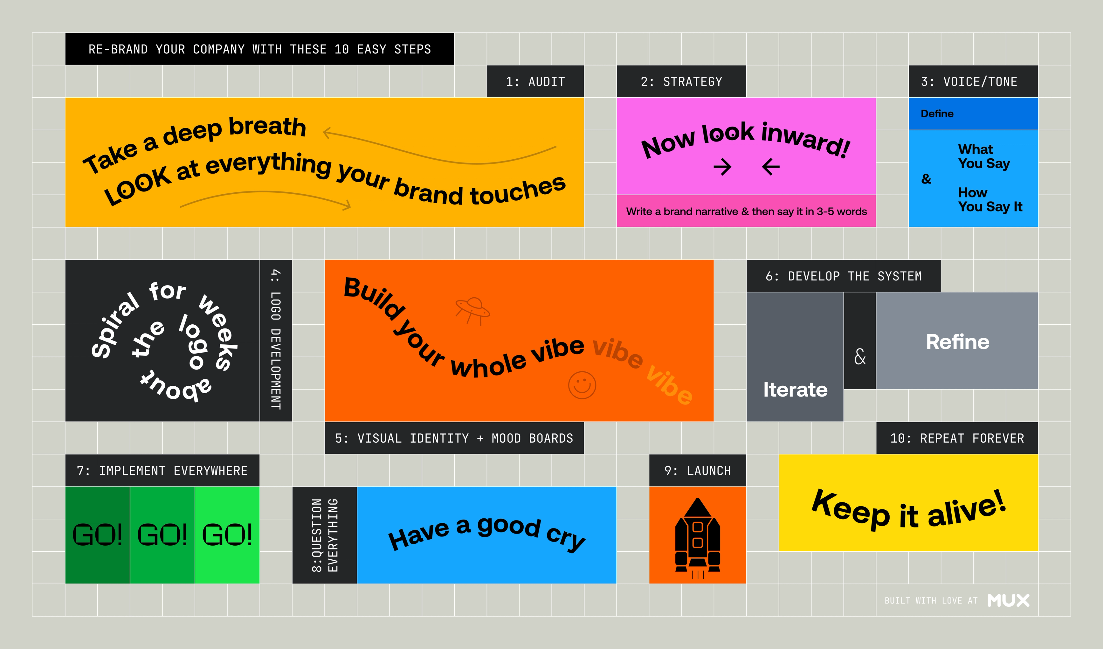
- Take a deep breath and look at everything your brand touches
- Take a look inward
- Develop your brand narrative
- Simplify that into a brand idea
- Give direction on what you say and how you say it
- Spiral about the logo
- Build your vibe
- Iterate and refine
- GO GO GO
- Cry
- Launch
- Don’t let it die
Rebranding is hard work. Really hard. Fun fact: if you don’t cry at some point during your refresh, you’re actually doing it wrong.
But the hard work completely paid off. Pushing through the really gritty, strenuous, detail-oriented, decision-fatigue-inducing work has resulted in a componentized world that is going to help us stand out in our market, in a way that’s truer to who we are, in a more efficient way that the whole company can benefit from.
With the right branding, you’ll be able to complete pages for Marketing faster. You’ll have more assets for your sales team. You’ll look better in webinars and at parties. And goshdarnit will your swag be sick as !@#$.
People have asked me for some advice…what would you recommend we do as a small startup that people might not expect? One of the things I tell them is to invest in brand.