Great documentation is the backbone of a great API company. It’s how developers size up a product before they sign up, and it’s where they spend all day once they’re on board. If you’ve had a good time integrating an API before, you know what I’m talking about. Great docs are a chance to turn a customer into a fan. Bad docs will just burn them out.
The problem: as your company grows, your docs become more comprehensive and even more complex. How do you scale them and keep that good experience?
We’ve been thinking about that question a lot lately. Today, we’re shipping a beta of our new documentation site. The new docs give us a foundation to build on as Mux continues to grow.
Here’s everything we learned that will save you trouble when thinking about how to scale your docs.
What makes good docs?
Two years ago, Dylan described what it takes to build better docs. A quick recap:
Good docs come from quality content and excellent usability. Quality content answers your users’ questions with simple and accessible language. Excellent usability connects your users to the content they’re looking for. A good interface can guide users through the learning journey and quickly connect them to resources they need to accomplish their task.
And…it’s that “usable interface” bit that’s been giving us some growing pains lately. Let’s dig into the problems we’ve experienced with our information architecture and technical foundation, and what we did to improve them.
Architecting for a growing company
Making it easy for users to find what they’re looking for and what they might need next is a critical aspect of a good user experience in your docs. (The cool kids call this “information architecture”). In the last few years, we started running into some challenges with this.
Since we last rolled out a new docs site and considered our information architecture, we’ve been busy doing things! Low-Latency Live Streaming, Real-Time Video, and, of course, Mux Player, just to name a few. Which raised some questions. How do users learn about these new products? How do we communicate the relationship between new and existing products? Where do these products go on the docs site? And most importantly, what happens when we add even more to Mux?
New products weren’t the only thing on our mind; we’ve also added new features to the docs site. Previously, we had guides and an API Reference. Now, we’ve added a changelog and (drumroll, new feature alert…) we’re also adding a webhook reference! How do we make new features accessible without being in the way?
Do we add Webhook Reference to the list of links in the upper right? Should Player be its own tab? I’m no designer, but, uh, yikes. This feels unsustainable.
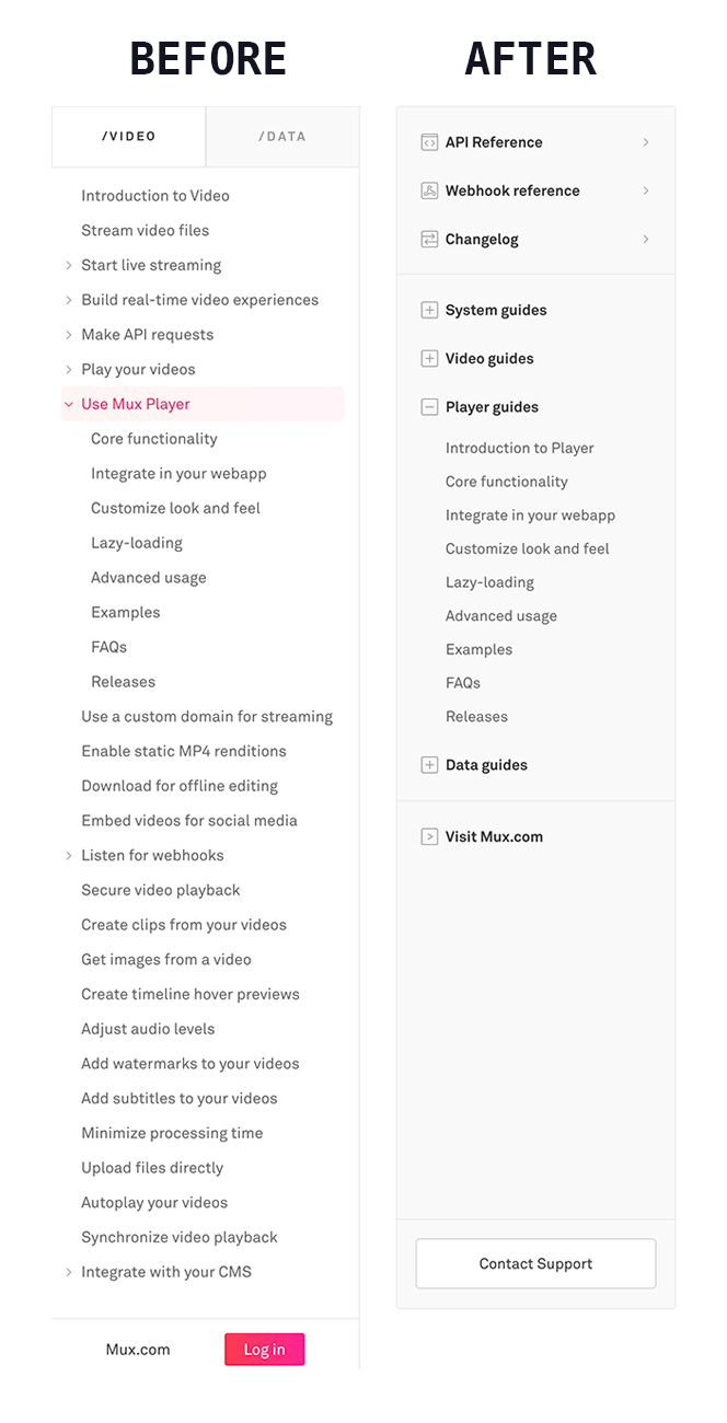
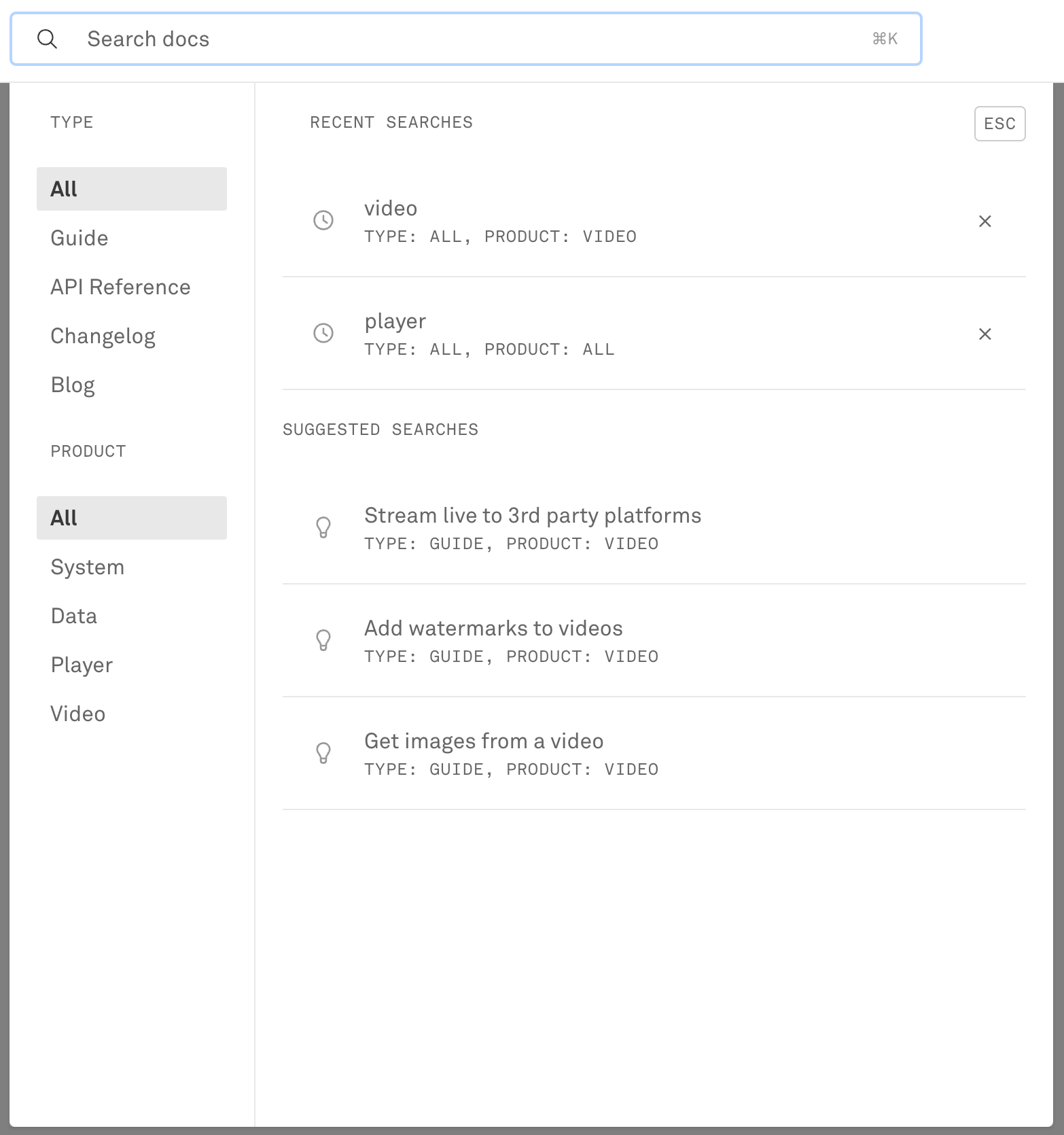
To give ourselves room to grow and to improve discoverability, we made three big changes to our docs site: a kickin’ new sidebar, a more powerful search, and a sweet new home page.
In the sidebar, we made room for more sections. Player has its own section like the first-class product we think it is. For guides that apply across the Mux spectrum, we have a new “System” section. This is a good home for the things that don’t clearly fit within a single product: generating API keys, adding users to your account, stuff like that. The new sidebar keeps users on task by collapsing sections that aren’t in use but leaves them visible and interactive so users can discover other products within Mux.
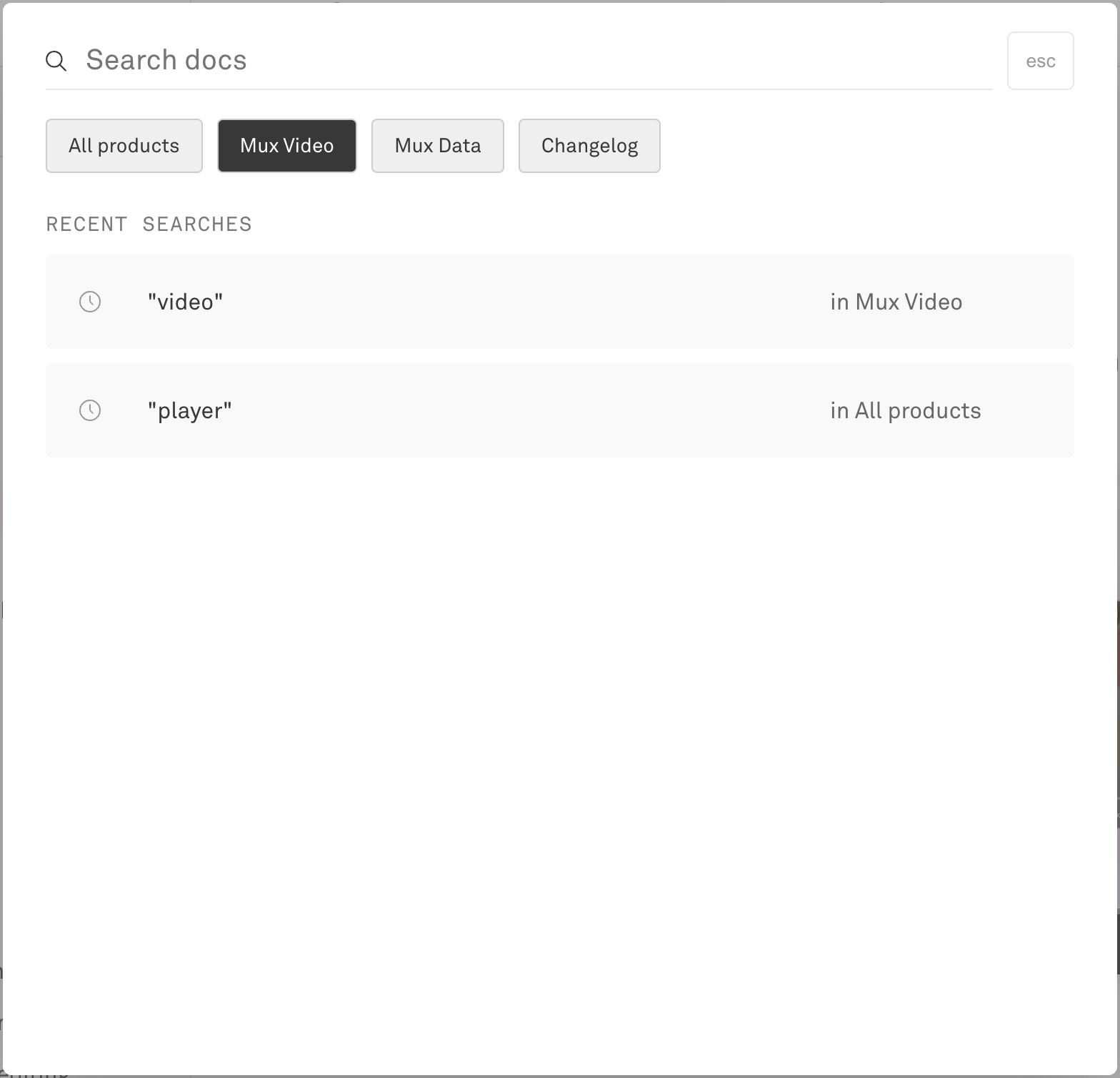
Search achieves similar goals. With new suggested searches, users can discover more of what they can do with Mux. More powerful search filters help users search across all products and parts of docs, or just the tiny slice they need. And, oh, what’s that last filter under “Type”? (Drumroll, new feature alert…again) Yup — we added blog search to the docs. We’ve talked a lot on our blog about how we solve problems using Mux. With blog search, we bring those solutions to docs. (From a technical standpoint, Algolia made this pretty simple!)
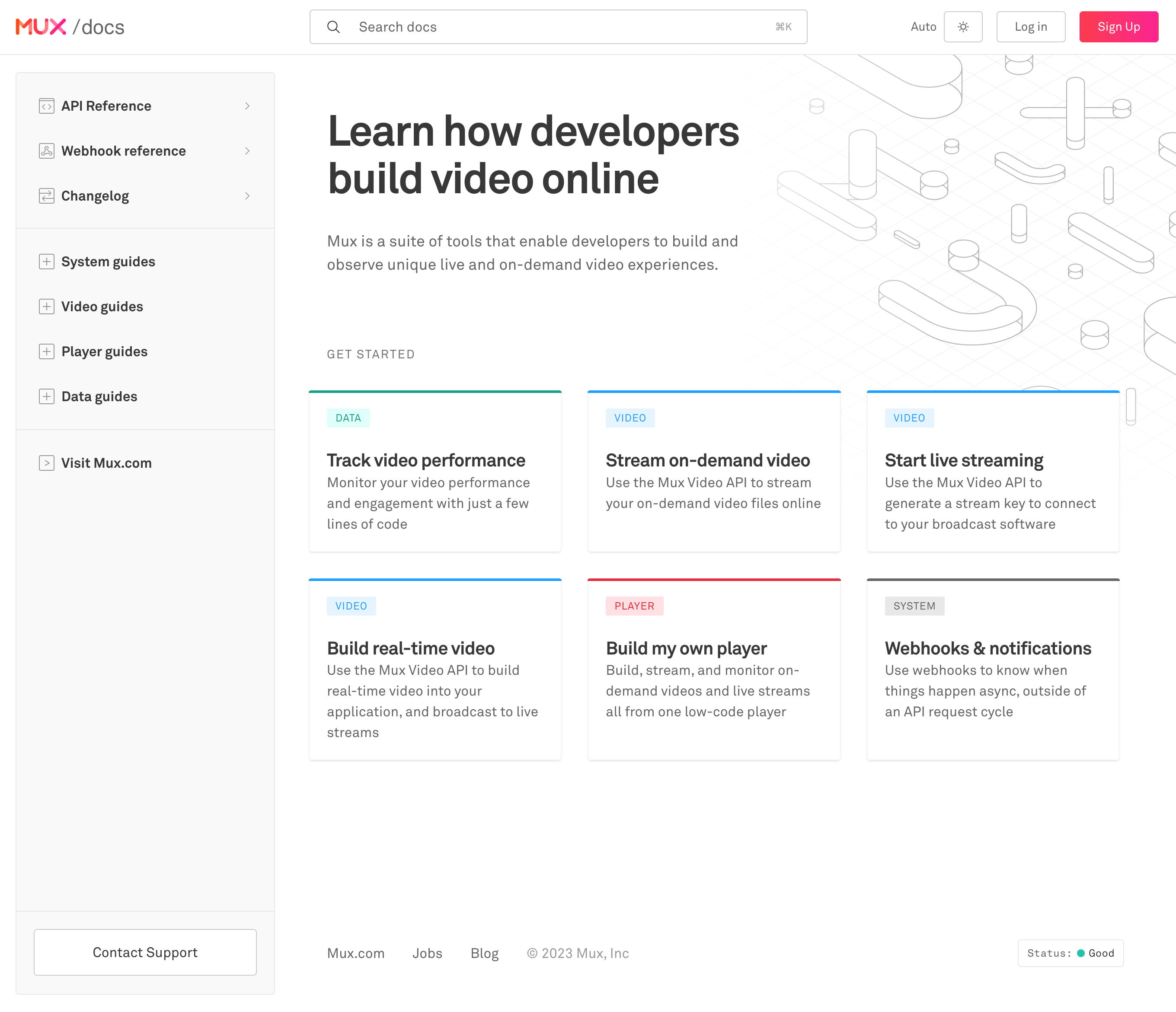
Finally, a sweet new home page. With a few suggestions on where to get started, we give new and seasoned Mux devs alike ideas of everything they could do with their video.
When designing your docs, consider the following. As your products grow, how can you hold the clutter back? How can you let users find things without getting lost? Give your users an overview of your information without overwhelming them. Give them ways to find what they need and lead them on their learning journey without getting in their way.
Making a great user experience with the tools of 2023
Of course, the best-structured docs will still drive users away if they’re spending all day waiting for pages to load. Underpinning your documentation with a solid technical foundation is critical to a snappy user experience that will keep the people happy. And I’m going to level with you: Our own user experience needed some work.
Our rich, interactive docs are great, but they sure do come with a lot of JavaScript, which affects loading speed and time to interactive as clients download and churn through all those lines of code. What if we had… less JavaScript? (I know, bold.) With the remarkable tooling that 2023 has brought us, turns out that’s not that hard. By moving much of our rendering code to the server with Next.js 13, and by ditching CSS-in-JS in favor of Tailwind CSS, we were able to do just that.
Next.js 13
Our docs site is built using the Next.js framework, thanks to the amazing developer experience it provides for building performant web applications. Next.js 13 has added a new way to organize code that they’re calling the app directory beta. Among the features the app directory provides, one huge change allowed us to send way less code to the client: React Server Components (or RSC for short).
Previously, to generate a web page, Next.js would run all of your code once on the server to render the page, and then a second time on the client to enable interactivity. But what if a component of your page doesn’t need to be interactive? Why does it have to run again on the client? RSC introduces a way to define whether a component needs to run only on the server (called server components) or on both the server and the client (called client components).
By default, all components in Next.js 13’s app directory are server components — so, by default, none of your code gets sent to the client. If you need a component to be interactive, you can make it a client component by adding the use client directive at the top of a component’s file. Here, we render a video and a description. Because the video is interactive, the video component needs to be shipped to the client, so we mark it with use client. And because the description isn’t going to change in response to any interactivity, it only needs to run once on the server, so it can remain a server component.
export default VideoWithDescription = ({ playbackId, description }) => {
  return (
    <div className="container">
      <VideoPlayer playbackId={playbackId} />
      <Description description="description" />
    </div>
  )
}"use client" // the use client directive instructs React to send this code to the client
import MuxPlayer from "@mux/mux-player-react"
const VideoPlayer = ({ playbackId }) => {
return <MuxPlayer streamType="on-demand" playbackId={playbackId} />
}export default Description = ({ description }) => {
return <p>{description}</p>
}It’s a simple example, but applied throughout a codebase, the savings add up. Especially when you have some expensive rendering code, like Prism for syntax highlighting, which can now completely stay on the server!
It’s a lot to digest. Believe me, I know. Especially when you get to implementation details like “what if my library doesn’t support client/server components yet?” or “what if I want the child of a client component to be a server component?” But it’s worth the hassle.
Curious to learn more about Server Components, including the answers to those questions? We spent more time with Server Components and wrote a whole blog post about it. Check out that blog post here!
RSC isn’t the only performance gain we realized from Next.js 13. @next/font allows us to self-host our fonts, which decreases font loading times. The Next.js 13 app directory’s Loading UI allows us to show a loading state instantly while the server renders the page and streams it to the client. (One of my biggest pain points with frameworks like Next.js was clicking on a link and seeing nothing happen while the server worked to render the page; now that’s all gone!)
Finally, with the app directory’s new Layouts paradigm, layout elements like navigation, sidebars, and footers can easily be applied to a set of pages, and then those pages only have to worry about what’s specific to them. This is a huge win for developer experience. What’s more, that layout component stays mounted across page navigations, allowing state and fetched data to persist. Our new sidebar would not have been fun to write without it!
Using the Next.js 13 app directory wasn’t without its challenges. It is, after all, not recommended for use in production, as it says at the top of its documentation. We’ve seen stability gradually increase throughout the early releases, though some small errors persist. And migrating from the old pages directory to the new app directory came with many little caveats, although the migration guide helped us on our way.

Migration also came with one large caveat, too: Our CSS styling solution didn’t work with Server Components. Which is a nice segue to…
Tailwind CSS
It’s time for CSS-in-JS to go. And it’s not just the fact that they don’t work with Server Components; problems with CSS-in-JS have been on our minds a lot lately. It’s not just us who think that — even some of the folks who drove CSS-in-JS adoption feel the same!
CSS-in-JS enabled an incredible developer experience. We could co-locate a component’s styles and logic, we could easily reference variables from that logic, and styles were scoped. At the end of the day, though, developer experience shouldn’t come at the expense of user experience. And the user experience for CSS-in-JS often caused problems: a client-side JavaScript runtime, unoptimized browser painting, and big JavaScript bundles like ours.
We couldn’t go back to traditional CSS, though, and lose the benefits of CSS-in-JS. This led us to the wonderful world of build-time CSS. With modern build-time CSS tools, styles are still tightly coupled to components so that we wouldn’t lose co-location and scoping, but all the heavy lifting is done on yarn build instead of on the client. While we strongly considered CSS Modules, in the end we decided on Tailwind CSS. Why?
Let me get ahead of the controversy and say: Yes, dear goodness, the markup for Tailwind is hideous. Just look at this class.
<div className="border-b border-gray-91 dark:border-gray-40 lg:border-b-0 relative lg:absolute after:content-blank after:absolute after:inset-0 after:bg-gradient-to-b after:from-white lg:after:[background:linear-gradient(to_right,theme(colors.white)_0%,theme(colors.white/0%)_20%),linear-gradient(to_top,theme(colors.white)_0%,theme(colors.white/0%)_30%),linear-gradient(to_left,theme(colors.white)_0%,theme(colors.white/0%)_30%)]" />I kid you not that is actually from our codebase. Actually, I lied: I shortened that class for consumption here on the blog. Any sane person would run away now. And yet, let me tell you why you shouldn’t.
I’ve been leaning more and more toward tools with strong opinions lately. Yes, those opinions might not match how I like to do things. (For example: I don’t like writing class names that long.) But in exchange for a bit of my freedom, I gain two enormous benefits: battle-tested solutions and easy collaboration. For every problem I might encounter, in a good framework, there is an opinionated solution that solves that problem without letting me dig myself a hole I can’t get out of. I don’t have to research and learn the hard way; someone else already did. And, maybe more importantly, any team member new to the project should arrive at the same solution, which means that we can maintain that code long after old team members leave. (Or, let’s be honest; it means I can understand why I did what I did long after I forget everything over the holidays.)
Tailwind CSS has great, strong opinions. Tailwind discourages premature abstraction by placing styles inline with markup. It’s that simple. When styles need to be reused, Tailwind pushes developers to use the component abstraction already built into the framework they’re probably using. And (I don’t see folks talking about this too much) Tailwind’s config makes it easy to fall into using a limited set of design tokens, which enforce consistency across a project.
Using Tailwind also has some other nice benefits. Utility-based CSS grows more slowly than traditional CSS because you’re likely reusing the same utilities throughout your project instead of creating new classes for every widget. Unlike inline styles, Tailwind still has full support for responsive design and pseudo-classes (like :hover and :focus) and pseudo-elements (like ::before and ::after). And it literally took me less than a day (repeat: a day!) to implement a prototype of dark mode (oh right, drumroll feature alert: dark mode!) to convince our designers that now’s the time.
Oh, one last thing. Here are a few hot tips to make working with Tailwind even easier.
- Don’t pass in classes as arguments. If you start doing that, you start asking, “where did this style come from?” and the mess begins anew. Guess how I know. If you want to change the style of a component, diligently use props and state instead.
- Ignore rule 1 for layout styles, like margins. Layouts should be controlled at the parent level, not the component level.
- For readability and for easily responding to state, use a class name utility like clsx. Just look at how nicely this breaks lines, clusters concerns, and applies classes in response to the isActive state!
<button
  className={clsx(
    "py-2.5 px-1.25 mr-2.5 inline-block",  // layout
    "font-mono uppercase text-sm tracking-widest",  //general typography
    // text color
    isActive
      ? "text-gray-20"
      : "text-gray-40 hover:text-gray-20",
    // active indicator
    isActive && "shadow-[inset_0_-2px_0_0] shadow-pink-56"
  )}
>
  {label}
</button>You, too, can have numbers like this
Brass tacks: how much difference does it all make? Will users really notice?Let's take a look at the size of our first-load JS as reported by Next.js. Note, it's not a perfect metric. The new design features a more complex and powerful sidebar. And it's difficult to isolate the contributions of Next.js 13 and Tailwind CSS. However, I think you'll agree that we've seen a sizable improvement.
page | before | after | difference |
|---|---|---|---|
api-reference JS | 217 kB | 115 kB | -47% |
changelog JS | 246 kB | 84.5 kB | -66% |
guide JS | 938 kB 😱 | 121 kB | -87% |
video/data landing pages JS | 206 kB | 82.4 kB | -60% |
Shared JS | 83 kB | 67.3 kB | -19% |
[Edit] In the time since this post was published, next-mdx-remote (which translates our guides from .mdx files into web pages) has added experimental support for RSC. By adopting this version, we reduced our guide JS an additional 70kb. This table has been updated accordingly.
If you’re curious about Tailwind’s effect on our CSS and document size, here’s a sample from one of our guides. CSS and HTML have together increased by about 20 kB. 20 kB is not insubstantial, but our savings in JavaScript give us more than enough buffer to absorb that growth.
page | before | after | difference |
|---|---|---|---|
guide JS | 938 kB | 190 kB | -80% |
guide CSS | 3.5 kB | 14.8 kB | 422% |
guide HTML | 17.7 kB | 30.9 kB | 174% |
Finally, everyone’s favorite metric, Lighthouse! Our Introduction to Video page has seen a Performance score improvement from 85 to 93 🥳. (Full disclosure, “Best Practices” has decreased from 92 to 83, largely on account of errors being logged to the console. But we anticipate that clearing out as problems associated with the new version of Next.js and React fall away.)
You don’t have to be as crazy as us to see gains like this, either. RSC and other benefits of Next.js 13 can be incrementally adopted by moving pages one by one from the pages/ directory to the app/ directory. (We dive deep into incremental migration and more in our blog post on Server Components). And because utility-based CSS frameworks like Tailwind tend to be smaller than the traditional approach, moving to Tailwind incrementally should lead to a gradual decrease in your shipped styles as well.
Whether or not you hop in on the latest tech trends of 2023, considering your tooling and how it affects your user’s experience is a critical part of building good docs. Watch those bundle sizes! Put the time into finally ditching CSS-in-JS. Your users will thank you.
Try it out and tell us what you think
Try out the new docs at https://beta.docs.mux.dev. At the bottom of every guide is a feedback form. Let us know what you think!