Understanding your bill shouldn't require a forensics degree or an afternoon lost in pdfs. Your video infrastructure costs matter, and you should be able to dive into the details without the detective work. That's why today we're launching Billing Breakdown in the Mux dashboard — a clear view of your spending trends and cost breakdowns, right where you need them.
The problem: Individual invoices in pdf format
We've heard from customers who wanted to answer seemingly simple questions like:
- "Why was July's bill 74% higher than June's?"
- "How much are we actually spending on live streaming versus on-demand?"
- "Is our video delivery cost trending up or down?"
- "Are we on track to stay within budget this year?"
Previously, answering these questions meant downloading invoices, opening spreadsheets, and doing your own analysis. Some customers even built entire internal dashboards just to track their Mux spending trends. That's not just inconvenient — it's time you should be spending building your product, not analyzing billing data.
The solution: Clear, actionable insights at your fingertips
The new Billing Breakdown page is designed to give you complete transparency into your Mux costs, with historical context that helps you spot trends and make informed decisions.
See your spending at a glance
The first thing you'll notice is a visualization of your last six billing cycles. Any invoices that have been issued in the six most recent billing cycles are shown but it does not include usage in the current cycle that has not yet been invoiced.
You can immediately see how your costs have evolved over time, with color-coded segments showing committed charges, any overages from previous cycles, and credits applied. No more hunting through emails or downloading PDFs to understand your spending patterns.
Understand the "why" behind cost changes
Every billing cycle summary includes helpful context. See a 74% spike in July? The dashboard shows you exactly what drove that increase — maybe you launched a new feature, or a video went viral. Either way, you'll know whether to optimize or celebrate. Notice a 22% decrease in September? You'll see which cost components came down and by how much. This kind of month-over-month comparison makes it easy to spot anomalies or validate that your cost optimization efforts are actually working.
Dive deep into the details
To get started, you can find the Billing Breakdown in the Billing area.
The Last 6 Billing Cycles chart makes it easy to see how the costs of usage fluctuate month-to-month. The billing period can include multiple invoices if more than one was generated by Mux.
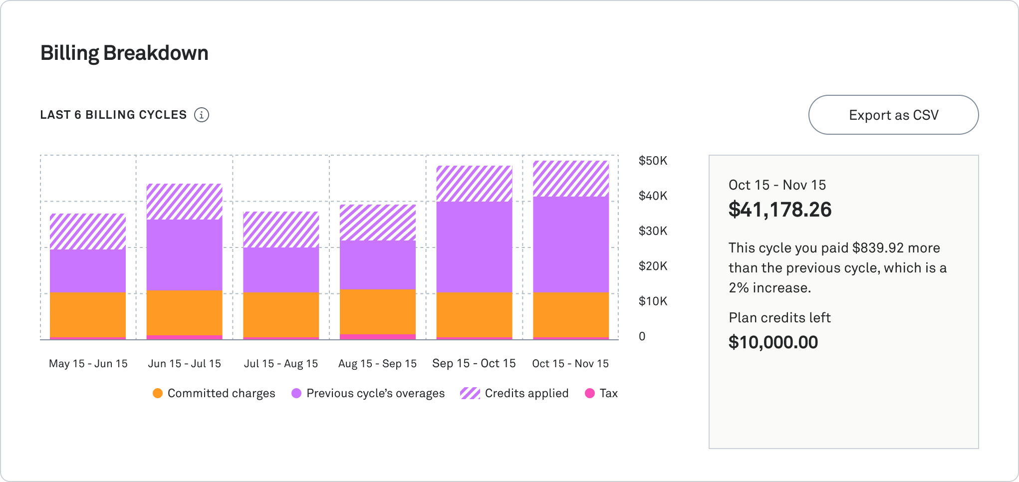
In the bar chart, we've color-coded everything so you can see your committed charges, any overages from last month, and credits applied—all at a glance. Hover over any month to see exact amounts.
If you hover over the bar chart, the tooltip shows the exact dollar amounts for each of these values and the total amount that is billed for each month.
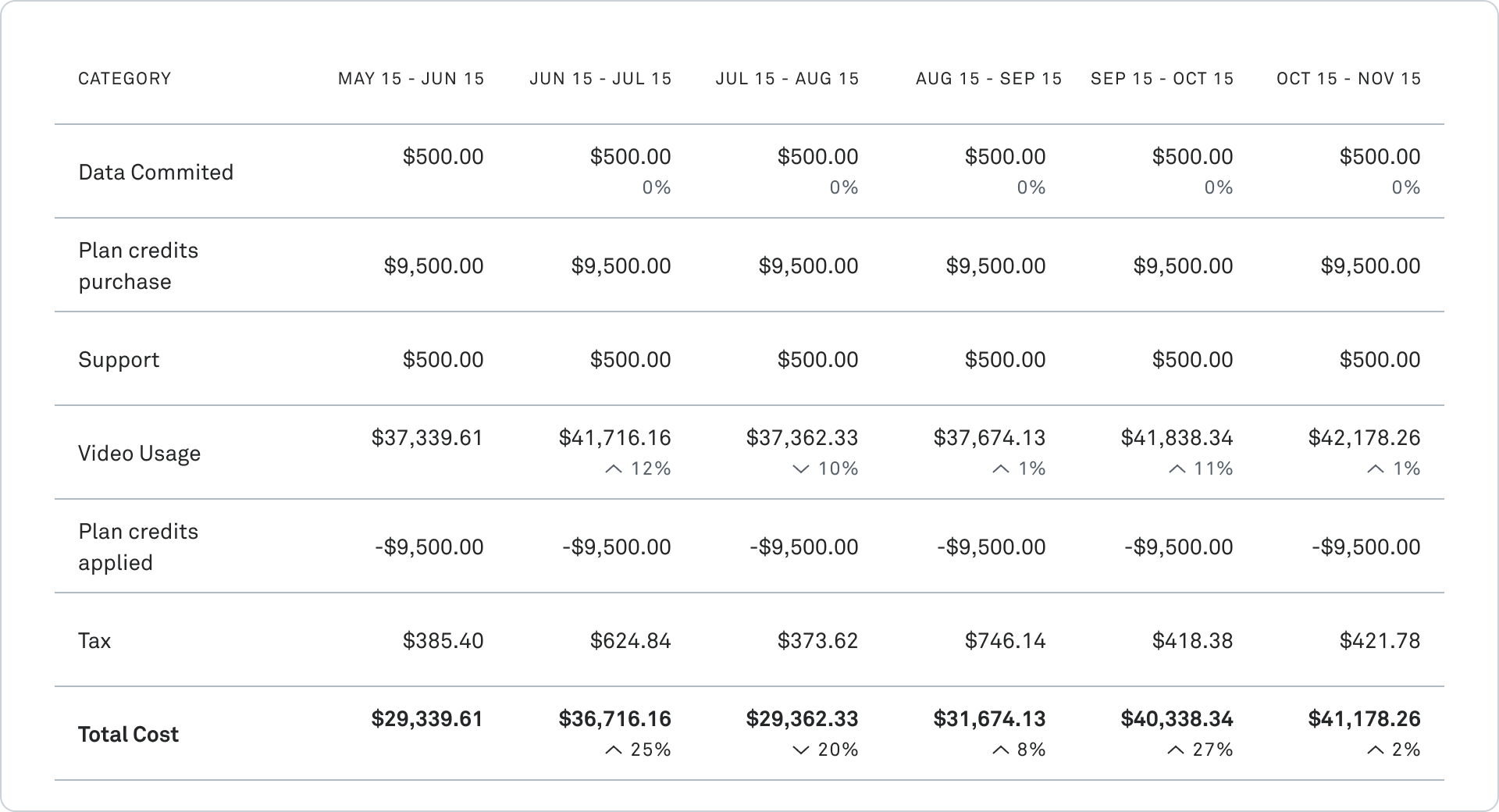
While the overview gives you the big picture, we know sometimes you need to get into the weeds. The detailed breakdown shows you exactly how your costs break down across the major areas of spending. You’ll see the categories that are relevant to your plan and usage: Video or Data usage, committed amounts, support charges or credits
Rows that are highly variable include a percentage below the value which indicates the percentage change,increase or decrease, from the previous month.
Check out the guide to learn more about each of the charge types visualized in these charts.
Mux Video
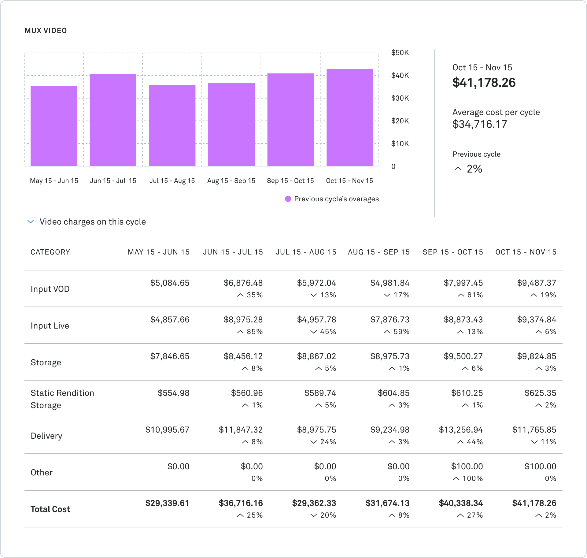
For Mux Video specifically, you can expand the cost breakdown to see granular details like Input (VOD and Live separated), Storage, Delivery costs by billing cycle.
Mux Data
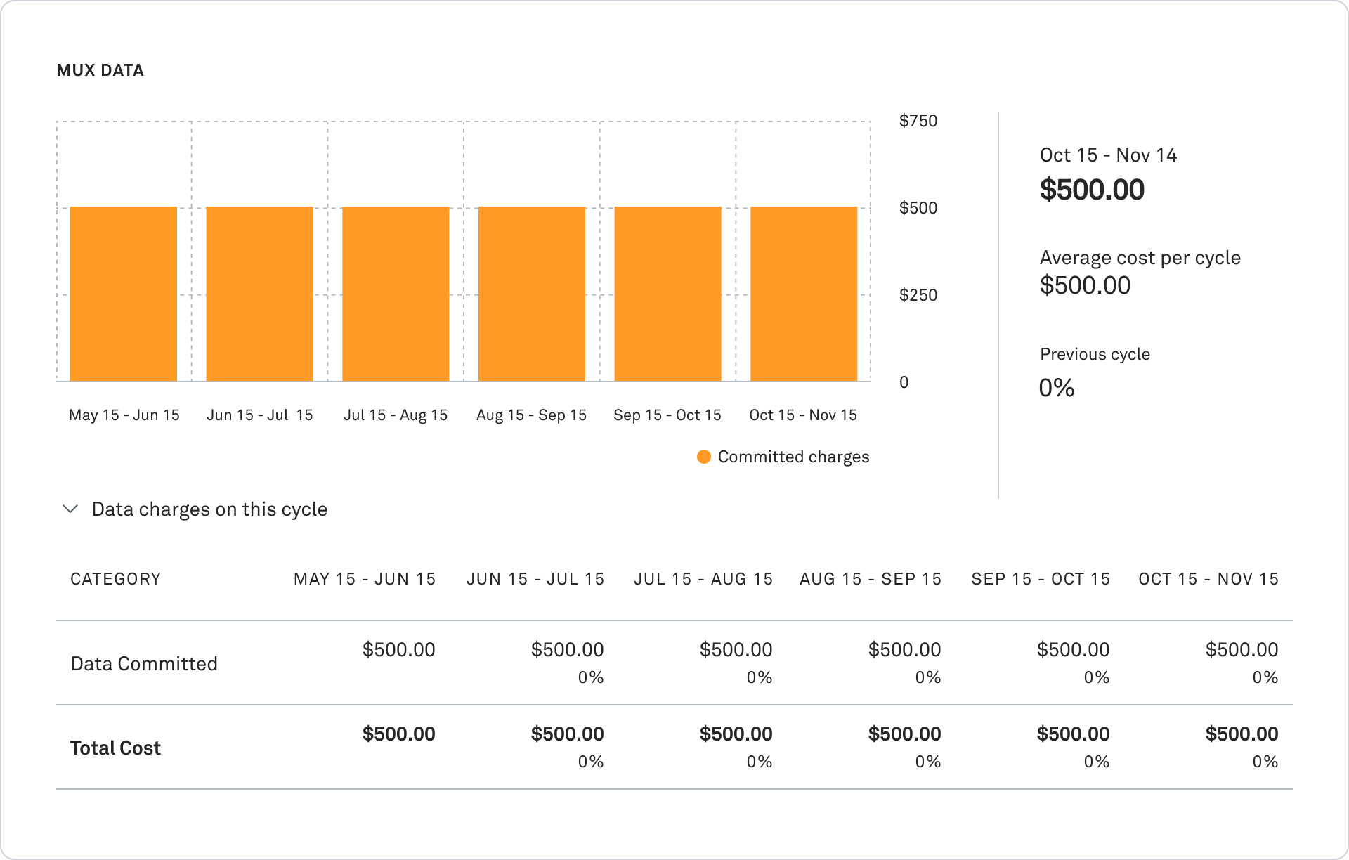
The Mux Data cost breakdown shows an overview of Mux Data costs over the billing period timeframe. The table below the Mux Data chart shows the breakdown of pre-committed costs for Data views and consumption-based view pricing.
Track your plan credits
If you're on one of our plans that includes monthly credits you can now see exactly how those credits are being applied and how much you have left.
Check it out today
The new Billing Breakdown is live now in the Mux dashboard. We've made this available to everyone — from Free Plan to Contract — because billing transparency shouldn't be a premium feature. Just log into your dashboard and click on “Settings” then “Billing” in the left navigation. Learn more about using Billing Breakdown in this guide.
We'd love to hear your feedback. Is there additional data you'd like to see? Different visualizations that would be helpful? Drop us a note.