To use Tailwind CSS or not to use Tailwind CSS: that is not the question we're going to answer in this blog post. We’re going to use it, because we need to get things done and preferably fast!
That’s one of many benefits Tailwind users enjoy, quickly prototyping designs by writing only HTML. My colleague Darius knows what I’m talking about.
In this post, we’re going to build a custom audio player with Tailwind CSS and Media Chrome, an open-source library that helps you build media players using Web Components. You'll also get to play with some of the web's most fun features, like CSS custom properties, SVG symbol maps, and even shiny new container queries.
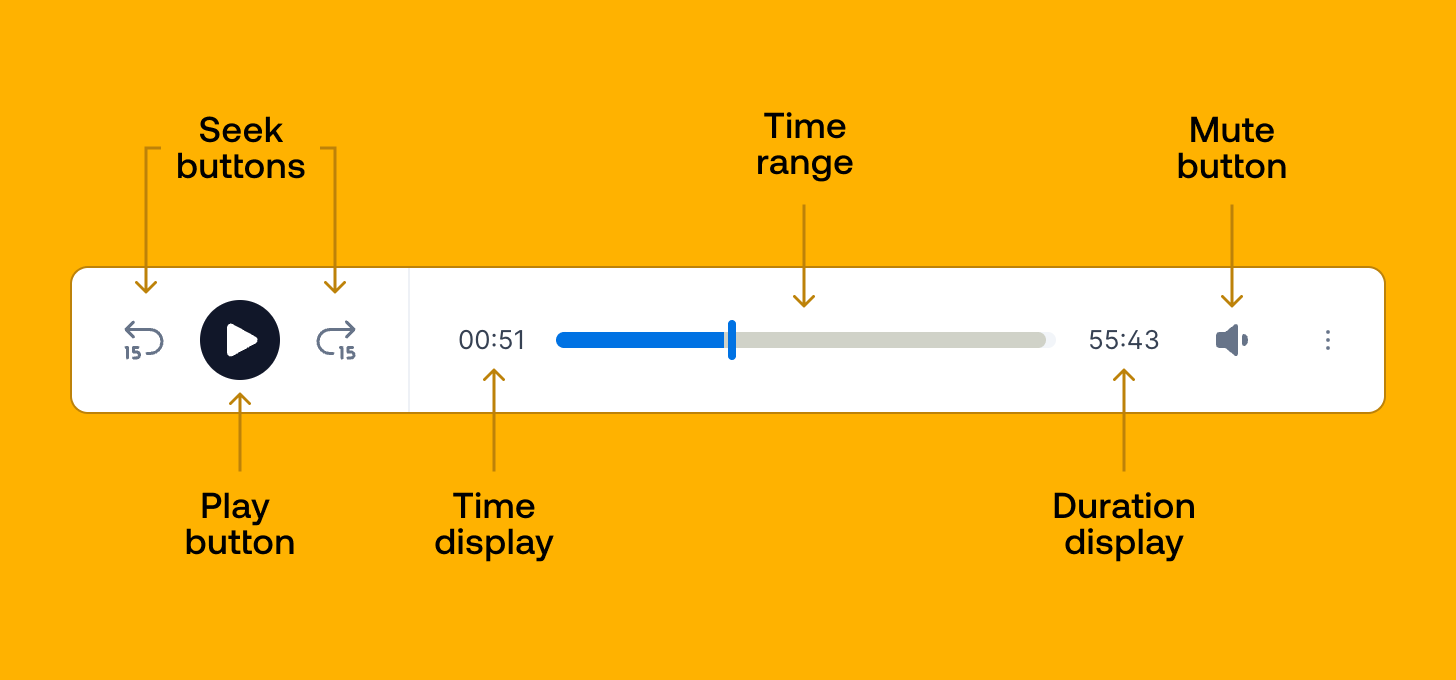
The design can be seen on the tailwindui.com home page at the time of writing. It should look a little like the image below when we’re finished.
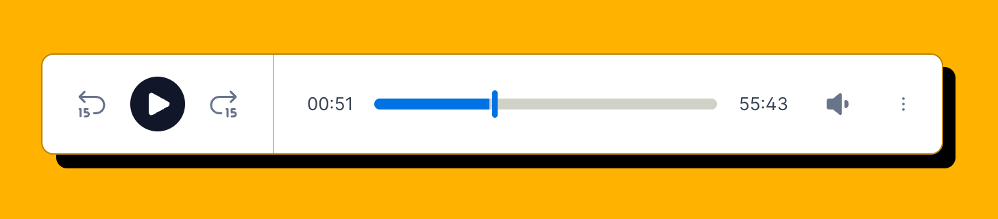
Check out the end result of what you'll be able to build by the end of this article.
If you’re not familiar with Media Chrome yet, Dylan’s post “Building the next generation of video players with Media Chrome” is a great read.
Media Chrome is a set of Web Components that make it really easy to build an audio or video player. Media players are one of the more complex parts of a web page, even the UI of the player can be challenging to get right.
There are a lot of media states to keep in sync with the UI and handling the user input can get especially tricky between different browsers and input types from mobile and desktop devices. Get used to edge cases!
Making UI components accessible is often unfortunately an afterthought, in Media Chrome all components get the right accessibility features out of the box. Aria attributes like aria-label, aria-hidden, aria-expanded, etc. and intuitive keyboard navigation.
There’s plenty more to cover why Media Chrome helps you smooth over a lot of pain points compared to slapping a few styled divs on the page but that’s not the purpose of this article.
Media Chrome controls and HTML structure
We’ll start out by defining the HTML structure of the audio player and cherry-picking the needed controls in the right order.
Before we can write out the custom HTML elements we add the script tag with the Media Chrome library. jsDelivr automatically bundles and minifies the library’s ESM modules if you add /+esm at the end of the URL.
The next required element is <media-controller>. We’ll not go into the specifics right now, but you can think of it as a container holding the media element and the UI controls and facilitates the communication between those two. The audio attribute makes sure no media display elements are shown and sets up media chrome appropriately for an audio player.
<script type="module" src="https://cdn.jsdelivr.net/npm/media-chrome@3/+esm"></script>
<media-controller audio>
<audio
slot="media"
src="https://stream.mux.com/O4h5z00885HEucNNa1rV02wZapcGp01FXXoJd35AHmGX7g/audio.m4a"
crossorigin
></audio>
<media-control-bar>
<media-seek-backward-button></media-seek-backward-button>
<media-play-button></media-play-button>
<media-seek-forward-button></media-seek-forward-button>
<media-time-display></media-time-display>
<media-time-range></media-time-range>
<media-duration-display></media-duration-display>
<media-mute-button></media-mute-button>
</media-control-bar>
</media-controller>The only special syntax on the <audio> element is the slot attribute which is a Web Component feature to slot specific elements from the normal DOM into a place in the element’s shadow DOM.
The <media-control-bar> holds all the controls which are laid out in the same order in which they occur in the audio player design.
So far the result should look a little like this:
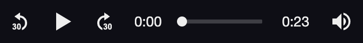
The default styles are quite minimal and let’s say functional. That’s intentional, it’s meant to be styled and made your own. Let’s do that!
Adding custom icons to a media player
Before we start blasting our project with Tailwind, there’s one quick change we have to make — put in icons that match the design. Luckily, these are icons that are freely available at heroicons.com. We can copy/paste the six icons we need into SVG symbols, which keeps the markup clean by separating the SVG content and the Media Chrome HTML.
The <svg> element gets a hidden class to hide the symbols map. Each symbol in the map gets a unique id which we can use later as a reference in the <use> tag.
<svg class="hidden">
<symbol id="backward" viewBox="0 0 24 24" stroke-width="1.5" stroke-linecap="round" stroke-linejoin="round">
<path d="M8 5L5 8M5 8L8 11M5 8H13.5C16.5376 8 19 10.4624 19 13.5C19 15.4826 18.148 17.2202 17 18.188"></path>
<path d="M5 15V19"></path>
<path d="M8 18V16C8 15.4477 8.44772 15 9 15H10C10.5523 15 11 15.4477 11 16V18C11 18.5523
10.5523 19 10 19H9C8.44772 19 8 18.5523 8 18Z"></path>
</symbol>
<symbol id="play" viewBox="0 0 24 24">
<path fill-rule="evenodd" d="M4.5 5.653c0-1.426 1.529-2.33 2.779-1.643l11.54 6.348c1.295.712 1.295 2.573 0
3.285L7.28 19.991c-1.25.687-2.779-.217-2.779-1.643V5.653z" clip-rule="evenodd" />
</symbol>
<symbol id="pause" viewBox="0 0 24 24">
<path fill-rule="evenodd" d="M6.75 5.25a.75.75 0 01.75-.75H9a.75.75 0 01.75.75v13.5a.75.75 0
01-.75.75H7.5a.75.75 0 01-.75-.75V5.25zm7.5 0A.75.75 0 0115 4.5h1.5a.75.75 0 01.75.75v13.5a.75.75 0
01-.75.75H15a.75.75 0 01-.75-.75V5.25z" clip-rule="evenodd" />
</symbol>
<symbol id="forward" viewBox="0 0 24 24">
<path d="M16 5L19 8M19 8L16 11M19 8H10.5C7.46243 8 5 10.4624 5 13.5C5 15.4826 5.85204 17.2202 7 18.188"
stroke-width="1.5" stroke-linecap="round" stroke-linejoin="round"></path>
<path d="M13 15V19" stroke-width="1.5" stroke-linecap="round" stroke-linejoin="round"></path>
<path d="M16 18V16C16 15.4477 16.4477 15 17 15H18C18.5523 15 19 15.4477 19 16V18C19 18.5523 18.5523 19 18
19H17C16.4477 19 16 18.5523 16 18Z" stroke-width="1.5" stroke-linecap="round" stroke-linejoin="round"></path>
</symbol>
<symbol id="high" viewBox="0 0 24 24">
<path d="M13.5 4.06c0-1.336-1.616-2.005-2.56-1.06l-4.5 4.5H4.508c-1.141 0-2.318.664-2.66 1.905A9.76 9.76 0
001.5 12c0 .898.121 1.768.35 2.595.341 1.24 1.518 1.905 2.659 1.905h1.93l4.5 4.5c.945.945 2.561.276
2.561-1.06V4.06zM18.584 5.106a.75.75 0 011.06 0c3.808 3.807 3.808 9.98 0 13.788a.75.75 0 11-1.06-1.06
8.25 8.25 0 000-11.668.75.75 0 010-1.06z"></path>
<path d="M15.932 7.757a.75.75 0 011.061 0 6 6 0 010 8.486.75.75 0 01-1.06-1.061 4.5 4.5 0 000-6.364.75.75 0
010-1.06z"></path>
</symbol>
<symbol id="off" viewBox="0 0 24 24">
<path d="M13.5 4.06c0-1.336-1.616-2.005-2.56-1.06l-4.5 4.5H4.508c-1.141 0-2.318.664-2.66 1.905A9.76 9.76 0
001.5 12c0 .898.121 1.768.35 2.595.341 1.24 1.518 1.905 2.659 1.905h1.93l4.5 4.5c.945.945 2.561.276
2.561-1.06V4.06zM17.78 9.22a.75.75 0 10-1.06 1.06L18.44 12l-1.72 1.72a.75.75 0 001.06 1.06l1.72-1.72 1.72
1.72a.75.75 0 101.06-1.06L20.56 12l1.72-1.72a.75.75 0 00-1.06-1.06l-1.72 1.72-1.72-1.72z" />
</symbol>
</svg>
<media-controller audio>
<audio
slot="media"
src="https://stream.mux.com/O4h5z00885HEucNNa1rV02wZapcGp01FXXoJd35AHmGX7g/audio.m4a"
crossorigin
></audio>
<media-control-bar>
<media-seek-backward-button>
<svg slot="icon" aria-hidden="true" class="w-7 h-7 fill-none stroke-white">
<use href="#backward" />
</svg>
</media-seek-backward-button>
<media-play-button>
<svg slot="play" aria-hidden="true" class="w-7 h-7">
<use href="#play" />
</svg>
<svg slot="pause" aria-hidden="true" class="w-7 h-7">
<use href="#pause" />
</svg>
</media-play-button>
<media-seek-forward-button>
<svg slot="icon" aria-hidden="true" class="w-7 h-7 fill-none stroke-white">
<use href="#forward" />
</svg>
</media-seek-forward-button>
<media-time-display></media-time-display>
<media-time-range></media-time-range>
<media-duration-display></media-duration-display>
<media-mute-button>
<svg slot="high" aria-hidden="true" class="h-5 w-5 fill-white stroke-white">
<use href="#high" />
</svg>
<svg slot="medium" aria-hidden="true" class="h-5 w-5 fill-white stroke-white">
<use href="#high" />
</svg>
<svg slot="low" aria-hidden="true" class="h-5 w-5 fill-white stroke-white">
<use href="#high" />
</svg>
<svg slot="off" aria-hidden="true" class="h-5 w-5 fill-white stroke-white">
<use href="#off" />
</svg>
</media-mute-button>
</media-control-bar>
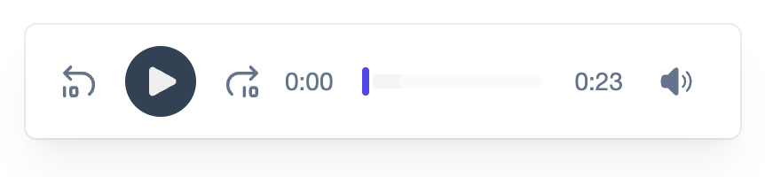
</media-controller>The new SVG icons can be used by referencing the needed symbol like so: <svg><use href=”#idref” /></svg>. Each SVG element gets a slot attribute which tells the browser to project the custom SVG icon in the button’s icon slot, replacing the default icon. The aria-hidden=”true” attribute removes the SVG element from the accessibility tree so it doesn’t get in the way of assistive technology. Finally, we can start adding some Tailwind classes to style the icons to match the audio player. A fixed width and height, a white fill, and a white stroke will do for this iteration.
Styling your media player with Tailwind CSS
With the HTML structure and the icons out of the way, let’s start styling! The most obvious thing we should change is the background color. Media Chrome sports a black background color by default and the new design has a white background.
It’s possible to change the background color of each control separately with Tailwind but Media Chrome has some low-level CSS vars (also known as CSS custom properties) that can do that in one go by defining it on a parent element — in this case, the media-controller element. This will save us from adding the duplicate markup we’d need if we did this for each element separately. Below you can see we set the CSS vars in the style attribute to transparent to reset the media and control background colors.
Next up is the control bar. We give it a fixed height of h-16, which translates to 4rem . By default 1rem, in most browsers, is 16px which gives the control bar a height of 64px. px-4 adds 1rem of horizontal padding. In addition, we added a white background, vertically aligned the controls, rounded corners, and added a 1px slate-colored border and a shadow (bg-white item-center rounded-md ring-1 ring-slate-700/10 shadow-xl). That’s it!
In the design, the play button is like a punched-out circle. These classes h-10 w-10 p-2 mx-3 rounded-full bg-slate-700 on the play button give it a fixed width and height of 2.5rem, a 0.5rem padding, a 0.75rem horizontal spacing, fully rounded corners, and a slate-colored background. The relative left-px offsets the play button 1px to the right so the geometric centers of both shapes align better.
The rest of the button icons are given the slate-colored variant for the fill and stroke instead of white (fill-slate-500, stroke-slate-500).
<media-controller
  audio
  style="
    --media-background-color: transparent;
    --media-control-background: transparent;
    --media-control-hover-background: transparent;
  "
>
  <audio
    slot="media"
    src="https://stream.mux.com/O4h5z00885HEucNNa1rV02wZapcGp01FXXoJd35AHmGX7g/audio.m4a"
    crossorigin
  ></audio>

  <media-control-bar
    class="h-16 px-4 bg-white items-center rounded-md ring-1 ring-slate-700/10 shadow-xl shadow-black/5"
  >
    <media-seek-backward-button class="p-0">
      <svg
        slot="icon"
        aria-hidden="true"
        class="w-7 h-7 fill-none stroke-slate-500"
      >
        <use href="#backward" />
      </svg>
    </media-seek-backward-button>
    <media-play-button class="h-10 w-10 p-2 mx-3 rounded-full bg-slate-700">
      <svg slot="play" aria-hidden="true" class="relative left-px">
        <use href="#play" />
      </svg>
      <svg slot="pause" aria-hidden="true">
        <use href="#pause" />
      </svg>
    </media-play-button>
    <media-seek-forward-button class="p-0">
      <svg
        slot="icon"
        aria-hidden="true"
        class="w-7 h-7 fill-none stroke-slate-500"
      >
        <use href="#forward" />
      </svg>
    </media-seek-forward-button>
    <media-time-display class="text-slate-500 text-sm"></media-time-display>
    <media-time-range
      class="block h-2 min-h-0 p-0 m-2 rounded-md bg-slate-50"
      style="
        --media-range-track-background: transparent;
        --media-time-range-buffered-color: rgb(0 0 0 / 0.02);
        --media-range-bar-color: rgb(79 70 229);
        --media-range-track-border-radius: 4px;
        --media-range-track-height: 0.5rem;
        --media-range-thumb-background: rgb(79 70 229);
        --media-range-thumb-box-shadow: 0 0 0 2px rgb(255 255 255 / 0.9);
        --media-range-thumb-width: 0.25rem;
        --media-range-thumb-height: 1rem;
        --media-preview-time-text-shadow: transparent;
      "
    >
      <media-preview-time-display
        slot="preview"
        class="text-slate-600 text-xs"
      ></media-preview-time-display>
    </media-time-range>
    <media-duration-display
      class="text-slate-500 text-sm"
    ></media-duration-display>
    <media-mute-button>
      <svg slot="high" aria-hidden="true" class="h-5 w-5 fill-slate-500">
        <use href="#high" />
      </svg>
      <svg slot="medium" aria-hidden="true" class="h-5 w-5 fill-slate-500">
        <use href="#high" />
      </svg>
      <svg slot="low" aria-hidden="true" class="h-5 w-5 fill-slate-500">
        <use href="#high" />
      </svg>
      <svg slot="off" aria-hidden="true" class="h-5 w-5 fill-slate-500">
        <use href="#off" />
      </svg>
    </media-mute-button>
  </media-control-bar>
</media-controller>
Finally, the time range is given a fixed height, rounded corners, and a light slate color. The min-h-0 sets the minimum height to zero to override the default auto value that flexbox applies to its content. If it wasn’t set to zero, setting the fixed height would not have any effect.
The time range is more complex because it consists of several inner elements like a track element, a progress bar element, a buffered bar element, a thumb element, etc. Since this HTML structure is part of the element's shadow DOM it can’t be styled from outside of the element with Tailwind. Here we’re required to use one of Media Chrome’s styling strategies like CSS vars.
Going over the inline style rules from top to bottom:
--media-range-track-background: transparent;
Sets the track background transparent because the background color was already set on media-time-range.
--media-time-range-buffered-color: rgb(0 0 0 / 0.02);
This makes the buffered progress bar element black with an opacity of 2%.--media-range-bar-color: rgb(79 70 229); Sets the background color of the playback progress bar to a blueish-purple color.
--media-range-track-border-radius: 4px;
Makes the corners of the time range rounded.
--media-range-track-height: 0.5rem;
Sets the height of the internal track element.
The rest is pretty self-explanatory, except for the following:
--media-range-thumb-box-shadow: 0 0 0 2px rgb(255 255 255 / 0.9);
This uses the box-shadow property of the range thumb to create a gap between the thumb and the progress bar.
All this together should result in something like the following image.
Adding player responsiveness for small containers
On a mobile device (or in a small container) the time range will probably get pretty short. Typically, it’s moved to the top of the control bar above the other controls. This is not too hard to implement with container queries and Tailwind. Container queries are relatively new but they are now available in all major browsers. Container queries enable you to apply styles to an element based on the size of the element's container. They differ from media queries which are based on the size of the browser window.
First, we need to add the @container class to the wrapping container. In our case, this is the media-controller element. Then we can add the classes block @md:hidden to elements that only need to be displayed on mobile and add the classes hidden @md:block on the elements for larger containers.
<media-controller
  audio
  class="@container block"
  style="
    --media-background-color: transparent;
    --media-control-background: transparent;
    --media-control-hover-background: transparent;
  "
>
  <audio
    slot="media"
    src="https://stream.mux.com/O4h5z00885HEucNNa1rV02wZapcGp01FXXoJd35AHmGX7g/audio.m4a"
    crossorigin
  ></audio>

  <media-time-range
    class="block @md:hidden w-full h-2 min-h-0 p-0 bg-slate-50 focus-visible:ring-slate-700 focus-visible:ring-2"
    style="
      --media-range-track-background: transparent;
      --media-time-range-buffered-color: rgb(0 0 0 / 0.02);
      --media-range-bar-color: rgb(79 70 229);
      --media-range-track-height: 0.5rem;
      --media-range-thumb-background: rgb(79 70 229);
      --media-range-thumb-box-shadow: 0 0 0 2px rgb(255 255 255 / 0.9);
      --media-range-thumb-width: 0.25rem;
      --media-range-thumb-height: 1rem;
      --media-preview-time-text-shadow: transparent;
    "
  >
    <media-preview-time-display
      slot="preview"
      class="text-slate-600 text-xs"
    ></media-preview-time-display>
  </media-time-range>

  <media-control-bar
    class="w-full h-20 @md:h-16 px-4 bg-white items-center justify-between @md:rounded-md @md:ring-1 @md:ring-slate-700/10 shadow-xl shadow-black/5"
  >
    <media-seek-backward-button class="p-0">
      <svg
        slot="icon"
        aria-hidden="true"
        class="w-7 h-7 fill-none stroke-slate-500"
      >
        <use href="#backward" />
      </svg>
    </media-seek-backward-button>
    <media-play-button class="h-10 w-10 p-2 mx-3 rounded-full bg-slate-700">
      <svg slot="play" aria-hidden="true" class="relative left-px">
        <use href="#play" />
      </svg>
      <svg slot="pause" aria-hidden="true">
        <use href="#pause" />
      </svg>
    </media-play-button>
    <media-seek-forward-button class="p-0">
      <svg
        slot="icon"
        aria-hidden="true"
        class="w-7 h-7 fill-none stroke-slate-500"
      >
        <use href="#forward" />
      </svg>
    </media-seek-forward-button>

    <div
      class="hidden @md:block h-full border-l border-slate-700/10 mx-4"
    ></div>

    <media-time-display
      class="order-last @md:order-none text-slate-500 text-sm"
    ></media-time-display>

    <media-time-range
      class="hidden @md:block h-2 min-h-0 p-0 m-2 rounded-md bg-slate-50"
      style="
        --media-range-track-background: transparent;
        --media-time-range-buffered-color: rgb(0 0 0 / 0.02);
        --media-range-bar-color: rgb(79 70 229);
        --media-range-track-border-radius: 4px;
        --media-range-track-height: 0.5rem;
        --media-range-thumb-background: rgb(79 70 229);
        --media-range-thumb-box-shadow: 0 0 0 2px rgb(255 255 255 / 0.9);
        --media-range-thumb-width: 0.25rem;
        --media-range-thumb-height: 1rem;
        --media-preview-time-text-shadow: transparent;
      "
    >
      <media-preview-time-display
        slot="preview"
        class="text-slate-600 text-xs"
      ></media-preview-time-display>
    </media-time-range>

    <media-duration-display
      class="hidden @md:block text-slate-500 text-sm"
    ></media-duration-display>

    <media-mute-button class="order-first @md:order-none">
      <svg slot="high" aria-hidden="true" class="h-5 w-5 fill-slate-500">
        <use href="#high" />
      </svg>
      <svg slot="medium" aria-hidden="true" class="h-5 w-5 fill-slate-500">
        <use href="#high" />
      </svg>
      <svg slot="low" aria-hidden="true" class="h-5 w-5 fill-slate-500">
        <use href="#high" />
      </svg>
      <svg slot="off" aria-hidden="true" class="h-5 w-5 fill-slate-500">
        <use href="#off" />
      </svg>
    </media-mute-button>
  </media-control-bar>
</media-controller>
All these examples can be found in this Codesandbox.
Creating a media player theme with Media Chrome
The final touch is creating a Media Chrome theme for easy distribution. It’s as simple as wrapping the HTML in a <template> element, giving it a unique id attribute, and replacing the <audio> element with a <slot name="media" slot="media"></slot>.
<template id="media-theme-tailwind-audio>
  <media-controller
    audio
    class="@container block"
    style="
      --media-background-color: transparent;
      --media-control-background: transparent;
      --media-control-hover-background: transparent;
    "
  >
    <slot name="media" slot="media"></slot>

    <media-time-range ...

  </media-controller>
</template>
After that we can render the theme by using the <media-theme> element, setting the template attribute to the chosen id and adding the <audio> element as the media slot.
<media-theme
  template="media-theme-tailwind-audio"
  class="inline-block w-full leading-none"
>
  <audio
    slot="media"
    src="https://stream.mux.com/O4h5z00885HEucNNa1rV02wZapcGp01FXXoJd35AHmGX7g/audio.m4a"
  ></audio>
</media-theme>
This post just scratches the surface when it comes to Media Chrome themes. Dive into the docs to learn more. Themes can be used across different players, including Mux Player.
Let us know if you created your own theme. We’d love to see it!