

It’s easy for a company building a developer tool to think of their dashboard as just a utility. It’s where you grab an API key, maybe tweak a setting, and then forget about it. After all, the big stuff happens in the API and SDKs, right? To be honest, we used to treat the Mux Video dashboard like that, too.
But over the last 8 months, we’ve worked on big changes to our dashboard because we kept running into the same, painful truth: your API might be great, but if your dashboard is an afterthought, people won’t stick around long enough to discover it.
Let’s talk about those big changes. And more importantly, let’s talk about what we learned along the way. About how we’ve come to believe the dashboard is a key surface for discovery and approachability, and a key part of the developer experience.
What’s new in the Mux dashboard?
Before we dig into philosophy, let’s quickly do the product announcement thing. We’ve made three updates to our dashboard:
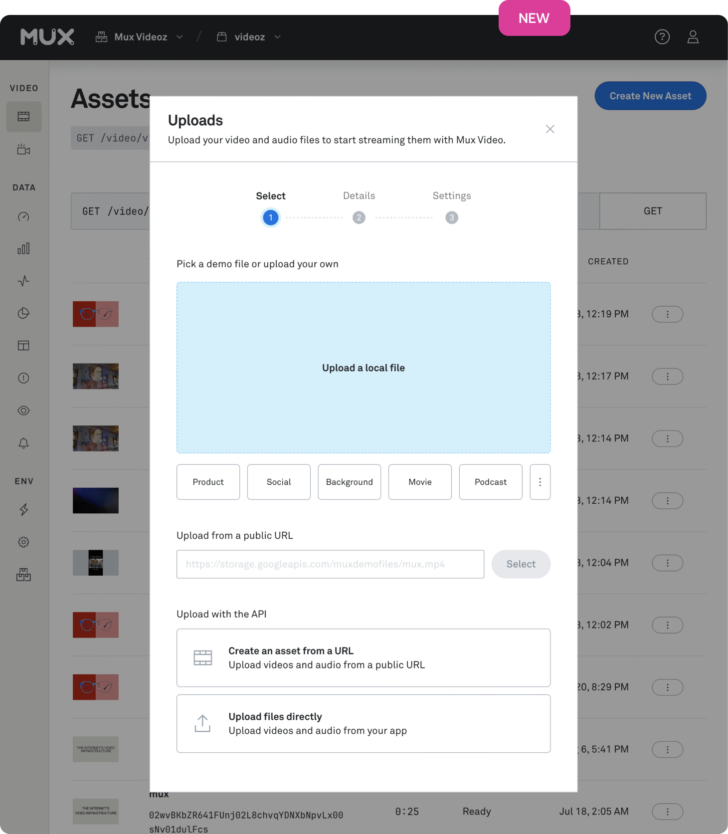
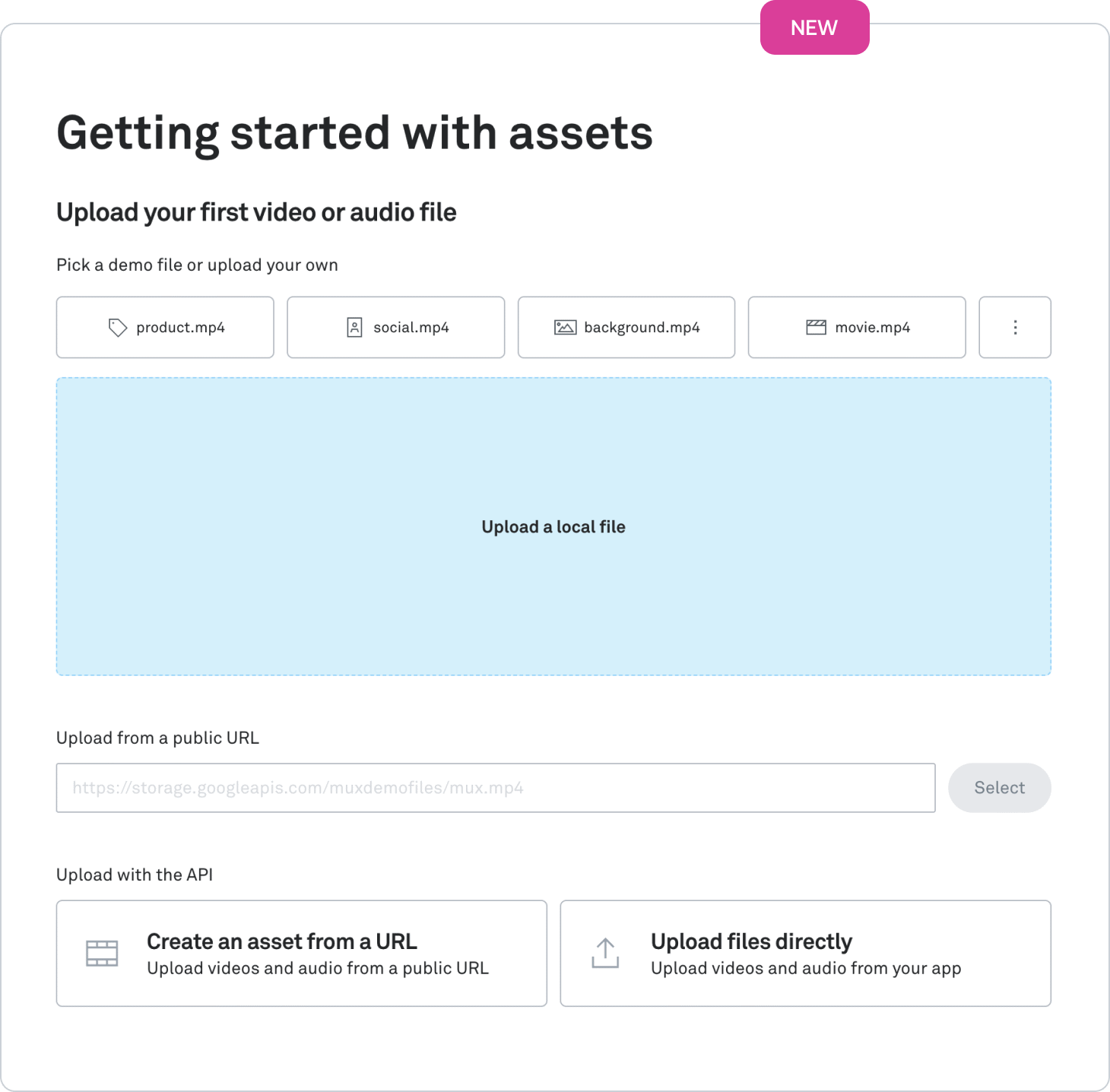
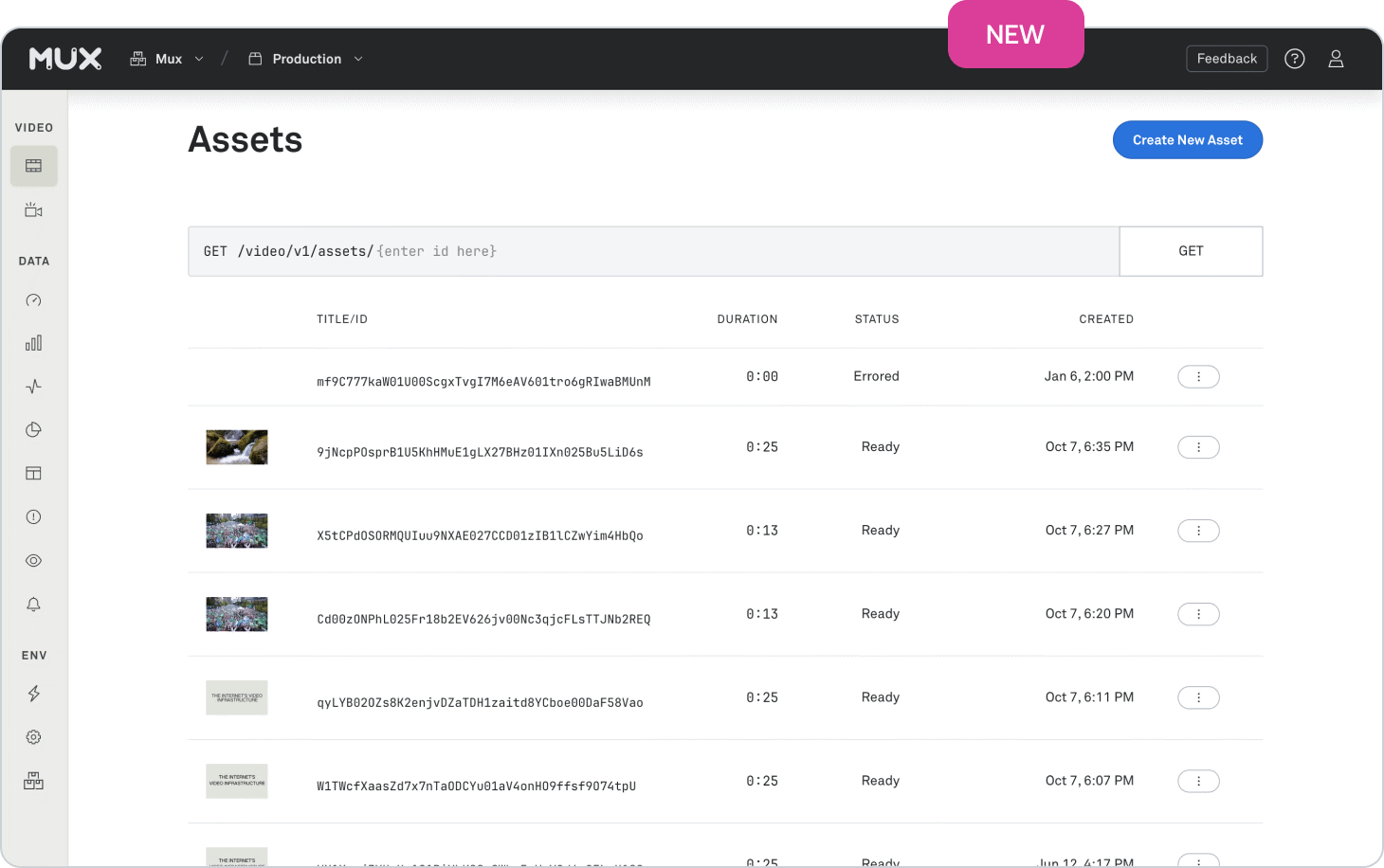
First – a few months ago, we rolled out an overhauled upload flow. Our old flow was more of an API builder, teaching you how to make asset create calls and direct upload create calls. Our new flow has a big ‘ol dropzone where you can drop one (or multiple) files. Below that, you can upload from a public URL or one of our demo files. And if you still want to think about code, we’ve got friendly links to the docs, too.
Second – new users trying out our on-demand video have recently been greeted by a new onboarding experience. We now prominently guide users through uploading and embedding their first asset. And for folks integrating Mux into their app, we’ve added more links to docs, tools, and examples so they can choose their own adventure.
Finally – we’ve made big changes to our layout. Besides a deep coat of fresh paint, we’ve made it easier for users to understand where they are and what they’re doing. In a familiar way1, users clearly understand what organization and environment they’re working in, and what features and settings they have access to. This is more than just CSS; we had to get deep into our code and change some fundamental routing building blocks that have been there for years.
And speaking of old code under the hood… We’ve done loads of work on our internal developer experience, too. Our tooling is all-new: we’ve standardized on ESM, moved from Webpack to Vite, and moved from Yarn to pnpm. And our new components are rebuilt on new foundations. Huge topics that have unlocked real velocity and deserve their own blog posts – stay tuned for a technical post!
What did we learn along the way?
We’ve been working hard to build features that make Mux welcoming for new users or users with more-simple video needs. In the past year alone, we’ve seen price cuts and a free plan, AI utilities, more-useful video metadata, more-simple video embedding, a Vercel Marketplace integration, and video engagement data.
But our Video dashboard was letting us down. Take, for example, our old uploader — is someone replacing a YouTube embed going to feel at home with that API builder? Mux Video isn’t just for API-driven use cases, but our dashboard made it feel that way. We were intimidating users. So we resolved to make our dashboard more approachable.
This work has helped our more advanced users, too. It’s frustrating to hear from folks who have been using Mux for years and didn’t know we had some cool feature. Now, we’re giving those users a way to discover features by making our product surface area more accessible to everyone. For example, these links help new and existing users understand our player ecosystem:
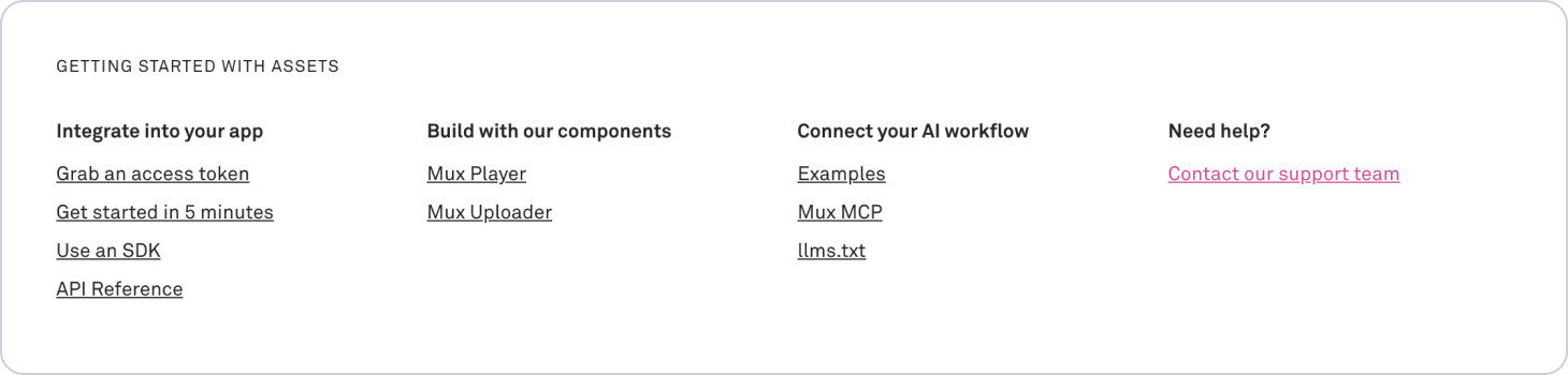
Of course, this effort comes at a cost. Once again, consider that upload page. Our new design might be “friendlier”, but it no longer educates our advanced users on how to use the API. But good developer experience requires good education. So we’re renewing our effort to link to the docs. Our dashboard UI was doing too much; by shifting the responsibility of education to the docs, the dashboard can focus on what it’s good at.
Putting it all together: the dashboard is for discovering features and interacting with them in friendly ways. And, when you’re ready to build them into your app, you should be able to find a link to the docs where you’ll learn how to build it yourself.
We've of course, always cared about our dashboard experience, and I dare say the first version of the Mux Video dashboard was a novel approach to blending a functional UI with API education–helping API users feel that the product was intentionally built for them. But then the product was actually successful, especially during those quarantine years when we all watched a lot of video. During that time, the need for scale and requests for major new features got a lot louder than the need to give attention to our dashboard experience. It unfortunately became a lower priority for our still relatively small team. We weren't blind to that fact, just emotionally and resource-torn. More recently, however, we've come to the understanding that our developer audience was much bigger than API-users alone, with some devs just wanting a great developer tool for their homepage videos. We aspire for Mux to be the place all devs turn to when they have a video problem to solve, but many were reserving Mux for advanced/complex video applications. This last year, we've been working to change that perception, and as part of that, giving our dashboard experience more of the attention it deserves.
We’re still at the beginning of this journey. You’ll still notice some components that could use some love. As we continue to make changes, keep an eye out for how we’re implementing this philosophy.
Should your dev tool company care about its dashboard?
Some of you might remember 2009’s Mac OS X Snow Leopard. Apple famously marketed it as “0 new features”. And yet, people look back fondly on Snow Leopard. Without headline features, it’s hard to put your finger on why. Everything just felt… refined.
I’ve been thinking a lot about that, lately. In a world where the fastest startup wins, there’s always pressure to ship new features instead of refinements. Those new features usually end up in the API; work on the dashboard (or the docs) isn’t as shiny or marketable.
I’d encourage you, though, to put yourself in your users’ shoes and follow their story. You’ll notice that it’s more than just the outcome. It’s about the little bits of friction your users encounter along the way, discovering and understanding and integrating a feature. If that friction builds up, you’ll have users mistaking you as too technical, instead of trying you out in their hobby project. Speaking from experience.
If you run a devtool company, don’t think of your dashboard as a second-class citizen. It’s an opportunity to impress new users and help existing users discover and integrate features. It’s a key part to a frictionless developer experience. It may not be the feature you’re putting on your billboard, but it’s one of your most important products.
Let us know if you have any thoughts!